How B2B webshops in DACH region can increase their conversion rate
Written by
Editorial TeamPublished on

The importance of B2B e-commerce is growing continuously and there is no end in sight. According to a publication by IFH Cologne, around 1.3 trillion euros were turned over in B2B online commerce in Germany alone. The trend towards e-commerce will continue to increase in the future, which is why more and more B2B companies are jumping on the e-commerce bandwagon in the DACH region as well.
However, the conversion rate in B2B web stores is still quite low. According to a study by the Baymard Institute, B2B conversion rates range between 6% and 8%. But that doesn’t mean that this has to be the case for all webshops. With the following 5 methods, webshop owners can manage to significantly increase their conversion rates and thus generate the best revenues for their business.
5 powerful methods optimize your B2B checkout
- Streamline your checkout flow
- Build trust & confidence
- Be clear and transparent about pricing, taxes & fees
- Provide free or multiple shipping options
- Offer multiple payment methods & flexible terms
How to optimize your B2B checkout to increase conversions
The checkout is one of the most critical parts of the buying process. It’s where buyers finalize their choices, fill in their billing and shipping information, preview their order, make a payment, and confirm the purchase. The goal of the B2B checkout is to make it as easy and frictionless as possible for business buyers to complete their purchase. Here are 5 ways to optimize yours and get closer to achieving this goal.
- Streamline your checkout flow
Research from the Baymard Institute found that nearly 1 out of 5 buyers abandon their purchase during the checkout because the process is too long or complicated. That’s a big problem you can’t afford to ignore!
With this in mind, it’s essential to limit the number of steps, clicks, and information you require from buyers to the bare minimum. The faster your checkout process takes to complete and the fewer distractions, the higher your conversions will be.
There is an ongoing debate about whether a single-page or multi-page checkout is best, but this is something you’ll have to test because both come with pros and cons. For example, single-page checkouts can be faster and have less distractions as everything exists on a single page. Still, they can be overwhelming with a single form with endless fields to fill out. On the other hand, a guided multi-page or step checkout process can be clearer for buyers but can take longer and have more distractions built in.
If you go with a multi-page checkout, providing a progress bar that highlights completed and remaining steps is a great way to incentivize and keep customers motivated to finish the checkout process.
Whatever option you choose, the key is to only require buyers to provide the information necessary to make a purchase. If you want more information, mark the mandatory form fields with an asterisk so buyers that don’t want to provide this information can complete the forms faster. Automation capabilities that allow returning customers to auto-fill their information based on past data and drop-down selections also significantly speed up the checkout experience.
- Build trust & confidence
As anyone who has bought something online knows, trust is crucial when deciding whether to make a purchase. Research shows that a lack of trust results in up to 18% of cart abandonments during the checkout process. Establishing trust is particularly important when converting first-time customers and laying the foundation for future transactions with these customers. Here are a few simple strategies to ensure your checkout instills a sense of trust and confidence in your buyers.
Security badges: Buyers are increasingly aware of security issues with rising incidents of online fraud, data breaches, and other scams. By adding secure payment icons and symbols like a checkout lock or card scheme logos (Visa, Mastercard, American Express), your buyers will feel confident that you’re doing everything possible to protect their sensitive information and payment details.
Customer logos: Featuring customer logos in your checkout shows potential buyers that you’re trusted by other businesses which help build confidence. Selecting logos from brands your target customers may know and respect can be particularly effective.
Accreditations: Displaying any accreditations or industry awards strategically throughout your checkout helps build trust with customers as they show that your business is legitimate and competent.
- Be clear and transparent about pricing, taxes & fees
As a business, one of the most important things you can do to increase your conversion rates in your checkout is to build trust with your buyers. One of the key ways to do this, beyond emphasizing security and adding customer logos, is by being 100% transparent with pricing, shipping costs, taxes and other fees.
B2B buyers don’t like unexpected costs that pop up at the last minute, so your checkout must highlight all extra fees and charges upfront in a way that’s simple and easy to understand. If you enable buyers to easily view and calculate their total order cost, you’ll build trust and give them more confidence in completing their purchase.
- Provide free or multiple shipping options
High extra costs, particularly shipping costs, are one of the biggest reasons for cart abandonments during checkout. You can attract new customers and boost your conversion rates by offering free shipping, but you’ll have to take on the extra costs. If you cannot absorb shipping costs, another strategy proven to drive higher conversions is providing multiple shipping options that deliver added flexibility regarding price, carrier choice, and delivery time frames.
- Offer multiple payment methods & flexible terms
One thing that can really upset customers is when they discover at the checkout that they can’t use their preferred payment method. In fact, studies show that almost 10% of customers abandon their cart due to a lack of payment methods available at the checkout.
To avoid losing sales in this manner and increase your conversion rates, it’s imperative to offer multiple payment methods. In the B2B world, providing options like PayPal, credit cards, wire transfers and other popular local methods is a necessity, but it’s nowhere near enough.
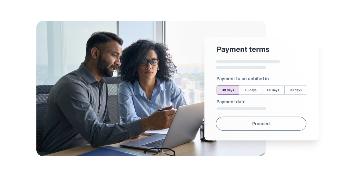
Today’s business buyers expect payment terms that deliver greater flexibility and fit their cash flow needs. As such, offering Buy Now Pay Later (BNPL) options at the checkout is critical to meet buyer expectations and has proven to increase conversion rates by 20-30%.

About the author
Mondu’s BNPL solutions are designed to help webshops like yours increase conversion rates by allowing buyers to experience a fast and frictionless B2C-like payment experience with flexible terms.
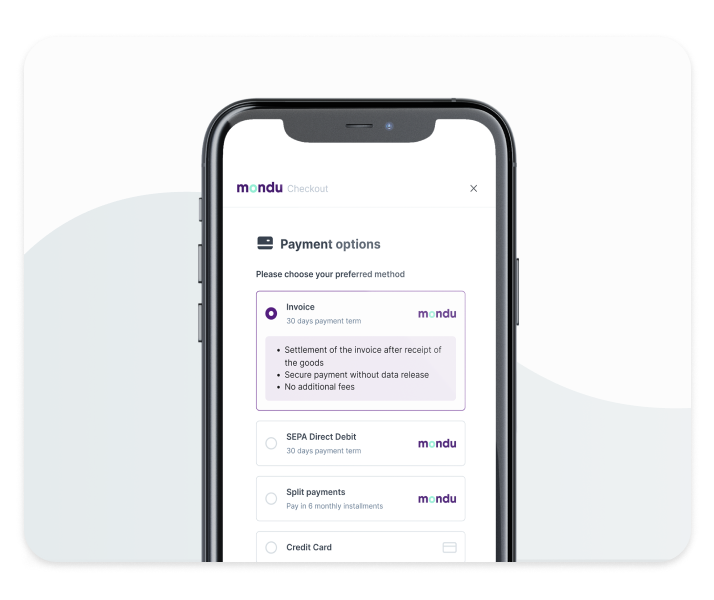
With invoice purchasing and SEPA direct debit, Mondu delivers the most popular payment methods for B2B buyers with flexible terms of 30, 60 or 90 days. Mondu assumes the risk of payment delays and defaults and pays vendors immediately after orders are shipped. Buyers pay later and Mondu supports collection and dunning in case of delayed payments.


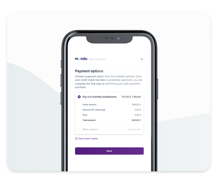
With Mondu’s split payment solution, you can let your customers divide their purchases into six equal interest-free payments. You get paid upfront and don’t have to take on any risk.
If you’re interested to learn more about Mondu, please find us at our booth E3.2 at E-Commerce Berlin EXPO – we are looking forward to meeting you.
Mondu GmbH was founded in Berlin in 2021 by entrepreneurs Malte Huffmann, Philipp Povel and Gil Danziger with the aim of simplifying B2B payment transactions. Mondu has a team of over 130 talented professionals from diverse backgrounds and with experience from the best companies, in tech and elsewhere. Mondu has raised $77 million in equity and debt financing, from leading investors Valar Ventures, Cherry Ventures, the FinTech Collective, and German bank VVRB.


