Increase conversion rate with proper User Experience (UX) design
Written by
Editorial TeamPublished on

Simplicity is a major element in eCommerce website design because customers want to get things done quickly. A great UX of your online shops are supposed to fulfill people’s desire and meet company’s goals. But every online retailer should understand that online shop with too many elements on a page may confuse visitors and decrease conversion rate.
In this article, we want to share tips that will help you increase conversion rate with UX improvement, such as:
– Revising design elements;
– Reviewing whitespace utilization;
– And outlining additional tools for great first impression.
Are you ready to increase conversion rate? Here we go!
Revising design elements
First of all, you will need to start off with paying special attention to your shop’s home page, because this will be likely the first page new prospects will see, and whether they will continue drilling down your content and ultimately convert or bounce off will heavily depend on what they see on your home page. This is especially relevant for direct traffic and affiliate related marketing action, the home page should pitch, promote and encourage visitors to drill down your content.
According to comScore report 60% of all traffic in the US is mobile, therefore your eCommerce store should utilize mobile friendly UX in order to improve and steamline interact with your website.
It is essential to ensure that your content is well integrated with clear Call-To-Action elements. Make sure to run A/B or multivariate tests on color, content, size and form of each element to ensure you are getting the most out of your traffic.
High-quality imagery of your products is another critical consideration. Ideally, you would want to invest in professional photo session or at least purchase a camera and lighting to produce high quality content. Alternatively, you may hire a freelancer to make your product images done properly. There is a general eCommerce principle, the more product images you show, the higher the conversion rate is. However, keep in mind while quality of individual visual look and feel element you have to balance it against page loading speed. In other words, high res image will do very little for your store if it takes more than 1.5 second for the page to load. Effectively, your UX should not only look great but also be as functional as possible on both visual and technological basis.
If you want to improve your visitors’ online experience and simultaneously Search Engine Optimization (SEO), make your online store more user-friendly, and better structured, clear site navigation should be realized. The most common tools that steamline website’s navigation are listing and re-listing product categories, breadcrumbs usage and keeping site logo as the door to a home page.
Reviewing whitespace utilization
Whitespace in eCommerce if done properly normally extends online shop visits and increases conversion rate. It is known that users pay less attention to the site overloaded with elements. Whitespace can be used as a volume knob, so it will be easier for users to focus on main elements, texts, icons and images. At the same time filling in the “gaps” and “waste space” is not always a great idea, and not a great whitespace utilization.
Pay attention that too much white space, especially for mobile website version may decrease conversion. In some cases, a lot of whitespace between website’s elements may trick your visitors into thinking there is nothing more to see.
Outlining additional tools for great first impression
According to research, visitors form their first impression about a website within 0.05 seconds. It consists of such factors as spacing, speed, structure, colors, fonts, symmetry and many others. To increase conversion rate, your website should be loaded in 1.5 seconds or you may lose about 40% of your prospective clients.
Remember, that eCommerce, especially in certain countries (like Germany) field is not the best sphere to test innovative and inconvenient layouts. Users generally expect a particular online shop layout. To ensure a seamless user experience for your target audience, consider conducting comprehensive user testing in Germany and make sure to recruit testers that fit your targeting criteria to evaluate both individual elements and the overall interface.
Try to emphasize your message with visual hierarchy. Visitors always pay more attention to the biggest element first. You can make the supporting your conversion goals message larger in size than others and people will definitely see it.
Using colors works great in drawing visitors’ attention to specific areas on a page. You can also use colors to convey visual hierarchy and draw their attention by establishing a relationship between elements.
“UX for eCommerce is like gas for a car. If you make a wrong choice, your car may be driven for some time, or it can break down immediately. While making a purchase, the visitor should not think about how to locate cart. Ideally, website functionality should be intuitive and drive your visitors to checkout. When visitors face difficulties in using different website elements or interfaces, they will be very likely lose interest quickly and leave the website.” Aleksey, Dinarys art director.
Here are several UX examples created by Dinarys for actual customers which resulted in improved UX and ultimately improved conversion rate.
Lucidera (cover photo)
Lusidera website utilizes clear and user-friendly design on both desktop and mobile devices. The website has effective user cart, call-to-action elements and nearly perfect utilization of the whitespace.
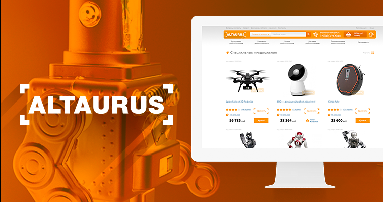
Altaurus
For this project Dinarys developed website design which included special offers functionality and UX, news and products video reviews sections on the home page. Primary aim of this project was to focus visitors’ attention on products.

Sisters Market
For this project, Dinarys created effective UX solution which incorporated product section and special offers directly on the homepage.

Well-thought UX design is a key to higher conversion rate and is essential for the success of your eCommerce store. The main objective is to provide your customers with a fast and simple shopping experience driving them to checkout.
Author: Dinarys


