When your customers get lost – you lose them
Written by
Editorial TeamPublished on

What is bad for your app or online shop? According to Tanja Borzel from the HolidayPirates Group, when the journey of your customer in it becomes more of an odyssey than a straightforward go-get-it. In this interview, Tanja shares spot-on insights on the importance of the right Design, User Interface and User Experience for your business – whether big or small. A must-read for anyone thinking these three are “something we’ll focus on later”.
Paulina, Ecommerce Capitals: You work as Product Manager, UX / Art Director at the HolidayPirates Group. Could tell us a bit more about what your job there entails and how it affects people – your users & customers?
Tanja Borzel, HolidayPirates GmbH: Being a product manager is a very diverse job. That’s why I love it. You get to do a lot of things, develop your skills and always learn something new. There are probably not two PMs that tell you the exact same story about how their work life is.
The UI/UX part in my job comes from me being originally a designer, so the look & feel, proper layout, typography and user flows are very important to me in all my projects. This means I’m going to challenge my team on these aspects and not release a project which doesn’t satisfy my expectations. Users will profit from this clarity to find important things faster and not get lost.
I’m a holiday pirate since the early beginning, when it was a tiny startup of five people. Now there are around 200 employees. While the company grew, processes had to be reviewed and adapted constantly, and new departments with new needs developed, all of which fuelled a feeling that I was basically doing a different job every half year. But of course, while the company itself matured, my main responsibility remained the same: Make sure we have a great product out there.
A very important part of my job are ideas. Without good ones, your product is going to be lifeless, mediocre. Excellent ideas can come from everywhere, but there are always at least ten times more ideas than time and resources. Collecting, curating and promoting the most relevant ideas into features are essential. Only the ones that will achieve key objectives should be promoted. I’m owning the roadmap, so I have to make sure everyone understands the strategy and the business value, in order to build what matters. There is so much more to the job. Basically, the quality of the PM decides if all parts of the product make sense, are useful and innovative, are released in a time- and resource-efficient manner, thus making the company money and not burning it.
What is the most difficult – and undervalued – part of your job?
Getting the needs and expectations of all business units aligned. Obviously nobody is ever truly happy with the amount of time and resources they get… So they try to get projects relevant to their own business area to be prioritized over other ones. It’s completely understandable, but it does take noticeable effort to maintain a strictly functional roadmap. If you don’t stand your ground, soon that roadmap is overcrowded with nice-to-haves and pet projects.
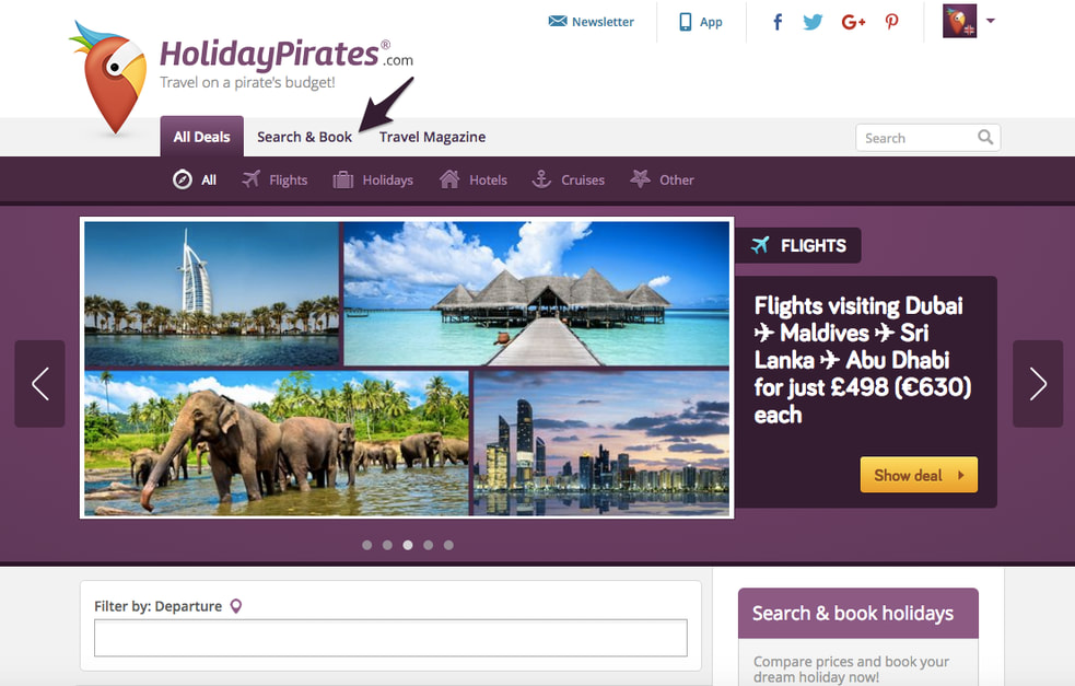
The HolidayPirates Group is a travel company offering flight, hotel, and package deals through 11 travel portals in 7 language versions. In terms of website/app design and UX, are there any stark differences between the markets you are present on? Is this all somewhat uniform – or perhaps there are some local peculiarities that you need to consider?
Design and UX are almost the same for all of our markets. Currently we’re operating only in European countries and the USA. This means the UX in our markets is not as different from each other than if we also had Asian or African markets. Nonetheless, there are differences between all the countries. They are “details”, but if we didn’t care for them, using website and app would constantly feel a bit off to our local users, and we might even face trust issues.
To start with the basics; in order to structure a number like “1000” and improve its readability, some countries will use commas, some periods and some white spaces. In our case we often publish prices in our deals, so the currency symbol comes into play as well. Some countries prefer to put the currency in front of the price, some put it after the numbers. Dates will not only vary in which separating character is used (backslash or full stop), but also if the day and then the month is displayed or vice versa. If you care to show the hour of the day, make sure to check if you’re operating in a 24-hour system or the usage of AM/PM is preferred.
Some market differences are also due to legal requirements, for example the cookie disclaimer that you’ll find on any EU-based website nowadays, which is not needed in the US. Something else that’s especially important for German users are trust badges. It’s much harder to convince a German to buy on an ecommerce platform if its trustworthiness is not vetted by trust badges.
But all those things have nothing on language itself. It might not look like it at first glance, but there are tons of interface texts all over app and website. There are multiple challenges here: During the design process, mocking up the UI in English just doesn’t do. It would only result in either cut-off or overlapping texts on the translated product. A short English text can expand up to 3 times in another language, and if you account for unlucky word wrapping situations, it might even become larger. This ruins the most nifty of designs, and is even more upsetting when discovered after the design phase, so you have to redo the layout completely.
Another challenge with language is how true the translation stays to the original. In our case, words have to convey their meaning concisely, but at the same time we try to give a “pirate” touch to everything! It’s just how our brand is, and the users love it. There is no way around a native speaker (regardless how fluent you are), and a lot of back-and-forth communication about the intention, meaning and feeling of a certain word or sentence.
What exciting projects have you recently worked on at HolidayPirates? And what exciting is yet to come?
We always have several projects in simultaneous development. They are all exciting in their own way, but probably I’m just too biased! I just love how each of them makes its own small or big contribution to the idea of HolidayPirates. Some add new functionalities for our users to enjoy, like the recent revamp of our custom travel alerts. Some enable long-awaited possibilities for our staff, like additional data tracking or new tools for our editors to find good deals and create mouth-watering articles about them.
We have a few very cool projects in the pipeline, that will definitely delight our users once they get a taste of it. But you’ll have to see for yourself – for now I have to keep it under wraps. All I can say is: You’re gonna be amazed!
Based on your Design and UX expertise, what changes in these two domains have you seen throughout your so far professional career? What did Design and UX mean in the past compared to what it means now?
When I started working in the field, skeuomorphism was still a huge thing, at least in the Apple-centric world. Everyone marvelled at the complexity and intense level of detail that went into making app icons. They were literally artwork! At the same time, people became increasingly uneasy about what that meant for asset sizes and the effort that had to go into visuals. With each Apple keynote the default icon sizes doubled, and the industry worried about exponentially growing app sizes.
Then in 2013 Apple finally abandoned their hyper-realistic visual language and produced their own take on flat design, which had been spearheaded by Microsoft and Google already for quite a while. Although it was a huge step into the opposite direction, Apple wouldn’t go all the way. They kept some whimsical things, and their extensive use of neon-colored gradients elicited a lot of criticism and mocking. My personal highlight in that regard was someone submitting a picture of the actual iOS7 “charging” home screen to a blog exclusively dedicated to showing made-up “redesigned” things for people to laugh at the impossible creations. Well played!
After that, it seems to be an almost all-encompassing win for flat design. This trend has continued to thrive and is very much alive and kicking today.
Design and UX have made much bigger leaps a couple of years back than now. Hardly anything groundbreaking has happened in the last few years. As with smartphone manufacturers, who have spent more than a decade refining their products, and now tend to improve them only marginally with every iteration, UI/UX patterns have become solved problems. Every designer has now vast libraries of interaction patterns at their fingertips, which offer an excellent starting point for all kinds of situations. As voice controlled devices enter our living rooms and augmented reality is becoming a recent trend popular once more again, those may present new challenges for the ones working on them. And also, there is the Internet of Things, which is very interesting and opens up a new playing field.
Can you give our readers any examples of best mobile website & app designs? What makes them great in our opinion?
I’m just in love with Duolingo. They push continuously for a better product and it shows. To some, their style is a bit too much on the “childish” side. I like how they combine flat design with cute illustrations. But the more relevant part is that they are constantly experimenting, running hundreds of small and big A/B tests all the time. Whether it’s features, UX, UI, core concepts … they are reinventing themselves every day. I have huge respect for this company, not just because of their great product, but also because they genuinely seem to be amazing people. Check out their blog.
Another all-time favourite of mine is Pocket. I use it every day. Really revolutionized my phone reading habits. What makes it great is the minimalist style that doesn’t get in your way, and how they carefully chose the options to customize that to your liking. If you’re going to read for hours in there, it’s important that you like what you see, after all. Sadly, not fully available in the free version of the app anymore, I was happy to discover the “dark” mode, helping me read through so many nights. To be able to choose a serif or sans serif font style made the typography nerd in me rejoice. Even better, they show mercy with those that have bad eyesight. Reading for hours in bed was made possible only because I could increase the font size enough to read without my glasses.
Putting brand names aside (and keeping them a secret), what is the other side of the pole? What are the worst examples – and the worst mistakes made?
Hard to believe nowadays, but horribly designed apps still exist. Maybe it’s just me digging around obscure topics and coming across niche products that didn’t age well. I can stand neither bad UX nor bad design, and whenever such an app makes it onto my device for whatever reason, it won’t stay long.
Hard to tell where bad design ends and mistakes begin. A no-go without doubt is everything that feels clunky or heavy, is slow and painful to use. You find those annoyances in every category, and they are closely followed by poor interfaces and bad user flows. For example when looking for a thing, which you know has to be in there, becomes more of an odyssey than a straightforward go-get-it.
I must say I don’t mind outdated or old-fashioned design styles very much, as long as the two above problems aren’t present. Not abiding by the latest visual trends is really not a big deal compared to huge usability issues. Old design isn’t necessarily bad design. Of course, I let that slide for old products only! If you have a something alive and kicking now, giving it a slick design is a must!
Looking at ecommerce and SMBs, is the focus on design and UX a must-do even for the smaller players? In your opinion, what type of smaller ecommerce businesses do – and do not – need to have their own designer & UX specialist on board?
In my opinion, nobody can afford subpar design and UX. I’m not saying that each and every business needs to employ a design specialist. This can be financially impossible when you’re only two people and just starting out. Depending on your line of business you might be able to make use of cheap website templates for a good while. But this can’t go on forever. There is the absolute need to get a professional involved, and the time for that is much sooner than owners of small businesses would think. It doesn’t even have to be hiring. There are really good freelance designers and UX consultants around. To answer the question, yes, it’s a must-do even for small players! If the fingers on one hand are not enough anymore to count your employees, it’s time to get a specialist on board.
How much does website/app design and UX affect sales? How can we measure this impact?
Design and UX have a huge impact on sales. Users nowadays are used to fast and smooth experiences, getting to where they want to be quickly, and buying what they want almost effortlessly. Sometimes just with one click. Or a voice command.
If implemented properly, excellent UI/UX removes all obstacles from the customer’s path to purchase, and it instills the trust they need to pull through with it. If they don’t trust that your product delivers what you promise, and they will actually receive it after the payment process, they won’t buy.
The impact of design and UX changes can be easily measured by tools that let you test your original version against one or several different versions. There is a huge variety of free and paid tools. You can perfectly start with trying what free ones have to offer, and they often enable you to perform simple tests without needing to get a developer involved. Starting split testing will give you unexpected insights. Soon you’ll thirst for more! I recommend getting a tool that offers additional services like crowdsourced testing. They don’t look cheap at first glance, but the quick real-world user feedback will speed up your product cycles immensely, not only saving you big bucks in the long run, but also leading to better sales figures.

What resources would you recommend to those of our readers who would like to better understand this impact?
If you start looking, you’ll find a plethora of research, case studies, benchmarks and articles. While it is notoriously difficult to assign a ROI to UX beforehand, the results of many done projects are out in the open.
My favourite to follow is the Baymard Institute. They conduct a lot of research and publish very detailed articles about their findings, which are also entertaining to read. They give a very good overview, and in-depth research is there to buy as well. I suggest to just go through their articles (a new one is published every two weeks) to get a good picture of what they’re doing. And you’ll learn a lot already by just doing that.
In your opinion, what are the current hottest trends in website/app design and UX that will soon rule the world? Is there anything that will be particularly popular in 2018?
For me, the next big thing is machine learning and AI. Although AI is a topic that has been around for quite a while, we are witnessing its rapid development right now. On a side note, I can’t recommend highly enough Tim Urban’s article on AI on his blog Wait But Why. Also, the complete rest of his posts as well. Thank me later!
Remember what the automobile did to the horse carriage industry? I’m not saying that designer’s jobs will completely vanish into thin air, but they will look very different pretty soon. Not 2018 though, but the transformation will start affecting the industry soon. We already see commercial products that aim to remove the tedious legwork part of the job. And we shouldn’t be afraid of technology taking the boring jobs from us. I’m all for getting rid of repetitive tasks; this frees up our time to focus on the more strategic side of design. As already hinted at earlier, vast libraries of UI components are available to efficiently assemble product interfaces. Design styles have become simple and easy to standardize through flat design. This means a machine can do it. We can be its boss, tell it what we want and correct it to get the best outcome. Split testing is an excellent candidate for being taken over by machines as well. Looking automatically for optimization potential, implementing that change and running the test, analyzing results and updating the design with the best version, and then starting the cycle again.
The biggest chance this whole automated machine learning process opens up is a groundbreakingly thorough personalization for each and every of your users out there. AI will take it to the next level. The user’s experience with digital interfaces will become fluid. The UI layer of a digital product will be able to automatically re-render content to accommodate a user’s unique needs, preferences, personality, etc. Designing for the majority will become obsolete. Although people may still fall into bigger and smaller groups, it’ll no longer be an issue to accommodate everyone. Providing different solutions to different people will become much less of a resource issue.
It’s easy to see that this development radically changes the notion of what a visual and a UX designer does. We might be surprised to discover that the robots that took worker’s jobs in factories are now finally coming for us. There are few examples where the revolution that took countless jobs, gives back the same or a higher amount of similar jobs. Those that were put out of work by the commercial success of cars didn’t all become chauffeurs or mechanics. And while the rise of motorized individual transport was followed eventually by more dire consequences, for example environmental problems, look at today! Technological advancements have overall done so much more good than bad. Completely new, previously unimaginable industries were born, there are types of work only science fiction writers could have thought of, and some more that nobody would have believed to ever exist 15 years ago. We’ll be fine. Unless AI kills us all, which might actually happen, but that’s not a hot trend for 2018. Yay!

Tanja Borzel is a UX Designer with more than 7 years of experience. She has previously worked as UX and UI designer at 6Minutes Media GmbH and Metaversum GmbH. In the last 4 years, Tanja functioned as a Product Manager and Art Director at HolidayPirates GmbH.
