E-commerce branding: Practical branding advice, study insights and examples from Germany
Explore e-commerce branding through insights from Adobe’s German study, practical advice, common mistakes and five German brand examples.

In e-commerce, customers cannot pick up a product, examine the store or speak to a sales assistant before deciding whether to buy. Instead, they judge a business through what they see and experience online: its website, product photography, language, reviews, checkout, packaging and service.
That makes branding a practical part of commerce, not a decorative layer added after the “real” work is finished. Strong e-commerce branding can help an online retailer become recognisable, communicate its positioning and create a coherent experience across the customer journey.
A 2026 Adobe Acrobat study offers a useful view of how company decision-makers in Germany assess their own branding. Its findings suggest that many businesses understand the importance of design but do not review it systematically. Combined with examples from German e-commerce brands, the research points to a clear lesson: a brand becomes stronger when its visual identity, message, product and customer experience reinforce the same promise.
Key takeaways
- E-commerce branding goes beyond logos and colours. It also includes positioning, tone of voice, website experience, packaging, delivery and customer service.
- Adobe’s 2026 study found that 74% of surveyed business leaders in Germany do not regularly review or optimise their designs.
- Website design, social media graphics and inconsistent branding across platforms are among the most commonly reported weaknesses.
- Strong branding does not require constant redesigns. It requires clear positioning, consistent execution and regular reviews.
- German brands such as everdrop, SNOCKS, air up, tonies and ABOUT YOU show how branding can be built into the product, communication and customer experience.
- The most effective ecommerce brands align their visual identity, message and operational delivery around one clear promise.
What is e-commerce branding?
E-commerce branding is the process of building a distinct and consistent identity for an online business. It includes the elements customers see, the words they read and the experience they have before, during and after a purchase.
The main components include:
- Visual identity: logo, colours, typography, photography, graphics and website design.
- Brand voice: the tone used in product descriptions, advertising, emails, social media and customer support.
- Positioning: who the offer is for, which problem it solves and why it is different from alternatives.
- Customer experience: navigation, product information, checkout, delivery, packaging, returns and support.
- Values and reputation: what the company claims to stand for and whether its actions support that claim.
A useful distinction is that a brand is the perception people form, while branding is the work a company does to shape that perception. Brand identity is the practical system of visuals, messages and rules used to keep that work consistent.
Why e-commerce branding matters
Online shoppers often have many comparable products available within a few clicks. A recognisable identity can make a shop easier to remember, but recognition alone is not enough. The brand also has to reduce uncertainty and make the offer feel credible.
Effective e-commerce branding can support several commercial goals:
- It makes the business and its products easier to recognise.
- It helps customers understand the offer and its point of difference.
- It creates consistency between ads, product pages, social content, emails and packaging.
- It can strengthen trust when the product, service and communication repeatedly deliver the same promise.
- It gives returning customers familiar cues that make the next purchase easier.
None of this means that design can compensate for a weak product or poor service. Branding sets expectations. Delivery, product quality, returns and support determine whether those expectations are met.

E-commerce branding in Germany: key findings from the Adobe study
Adobe Acrobat surveyed 350 company decision-makers in Germany between 14 and 19 February 2026. Adobe describes the research as a representative nationwide study examining how businesses manage visual branding and how design relates to customer interest and purchasing decisions.
Most companies do not review their branding regularly
According to the study, 74% of respondents do not regularly review or optimise their designs. Only 20% believe their current visual elements are strong enough to need no revision.
At the same time, 23% say they are fully satisfied with their branding. These figures relate to slightly different questions, which suggests that confidence can vary depending on whether respondents are assessing individual visual assets or their overall brand presence.
The broader implication for e-commerce branding in Germany is not that every company needs a rebrand. It is that branding needs ownership and a review process.
Product ranges, customer expectations, channels and competitors change. A system that worked three years ago may now be inconsistent, difficult to use or disconnected from the company’s current positioning.
Website design and cross-channel consistency are common weaknesses
Web design, consistency across platforms and social media graphics were each identified as a major weakness by 15% of respondents. Another 12% were dissatisfied with their logo because they felt it did not stand out sufficiently.
Brand tone performed better, with only 5% naming it as a weakness.
For ecommerce businesses, these findings are especially relevant. A customer may discover a product through an advertisement, compare it on a marketplace, visit the brand’s website, subscribe to an email and later contact support.
When the visual language, message or level of quality changes dramatically between those touchpoints, the brand feels fragmented.
Many companies do not know where to begin
The study found that 16% of respondents did not know where to start with branding optimisation, while 15% said branding was not currently a marketing priority.
Adobe’s accompanying study materials also state that 28% of companies had never asked customers for feedback on their branding.
This is an important gap. Companies do not have to begin with a complete redesign. They can start by identifying the most visible mismatch: an outdated website, inconsistent product photography, unclear messaging, weak mobile usability or packaging that does not reflect the online experience.
Minimalism is popular, but distinctiveness still matters
Thirty-four per cent of respondents said they deliberately use a simple visual identity so their products can speak for themselves. A further 24% aim to differentiate themselves through creative or unconventional visuals.
These approaches are not necessarily opposites. A simple brand can still be distinctive, while an expressive brand can still be easy to navigate.
The question is whether the creative direction supports the positioning. Minimalism without recognisable elements can make a shop look generic. Visual novelty without clarity can distract customers from the product.
Younger decision-makers are more critical of their branding
Among respondents aged 18 to 24, 38% believed their branding needed significant improvement, and 25% did not know where to begin.
In the same age group, web design was the leading concern, mentioned by 38%, followed by social media at 25%.
The sample sizes for individual age groups are not provided in the published study, so these breakdowns should be treated as directional rather than as a complete picture of every German company.
Even so, they underline how closely ecommerce branding is connected to digital execution. For younger leaders in particular, the challenge appears to be less about recognising the problem and more about turning that awareness into a structured process.
What strong ecommerce branding looks like in practice
Strong ecommerce branding does not require every touchpoint to look identical. It requires them to feel like parts of the same system.
The following principles translate the study’s findings into practical work.
1. Start with positioning, not colours
Before choosing fonts or redesigning a homepage, define the brand’s core position:
- Who is the priority customer?
- What problem does the product solve?
- What makes the offer meaningfully different?
- What should customers remember after visiting the shop?
- Which claims can the business consistently prove?
This prevents the visual identity from becoming a collection of personal preferences. Design decisions become easier when they have to support a clear position.
2. Build a usable brand system
A brand style guide should be practical enough for internal teams, agencies and external partners to use.
It can include logo rules, colour values, typography, image style, iconography, tone of voice, terminology and examples of correct and incorrect applications.
For ecommerce companies, the guide should also cover:
- Product-page imagery
- Marketplace listings
- Paid social formats
- Email templates
- Packaging
- Returns materials
- Presentations and event materials
- Offline retail appearances
Ecommerce branding often stretches across many channels, and consistency becomes harder as the number of people producing content grows.
3. Treat the website as a brand experience
Website design is not only about aesthetics. Navigation, page speed, product information, mobile usability and checkout all influence how the brand is perceived.
A premium visual identity paired with confusing product pages creates a credibility gap. A friendly, accessible brand with an unnecessarily complicated returns process creates the same problem.
The operational experience should support the personality and promise communicated by the design.
4. Make the product part of the brand
The strongest ecommerce brands often have products that express the positioning without requiring a long explanation.
The product format, naming, packaging or interaction makes the idea tangible. This is particularly useful online, where customers must understand the concept quickly.
A brand promise becomes more credible when it is visible in the product itself rather than stated only in campaign copy.
5. Use customer feedback before a full redesign
Customer feedback can reveal problems that internal teams no longer notice. Ask recent buyers, repeat customers and people who considered buying but did not complete a purchase.
Useful questions include:
- What did you think the brand offered when you first saw it?
- Which part of the website made the offer clearer or more confusing?
- What made the shop feel trustworthy or untrustworthy?
- Which other brands did you compare it with?
- What do you remember about the brand a week later?
The goal is not to let customers design the identity. It is to understand whether the identity communicates what the business intends.
6. Review branding regularly, but do not redesign for novelty
A brand review can be scheduled every six or twelve months, with additional reviews after major changes such as entering a new market, targeting a new audience, launching a product category or adding a sales channel.
The review should ask whether the brand is still:
- Clear
- Distinctive
- Consistent
- Relevant
- Easy for teams to use
- Supported by the customer experience
Updating weak assets is different from changing the identity simply because the internal team is bored with it. Familiarity is valuable, and unnecessary redesigns can remove recognition that took years to build.
Five examples of e-commerce branding from Germany
The following brands use different models and visual styles, but each demonstrates how a clear idea can be translated into the product, message and customer experience.
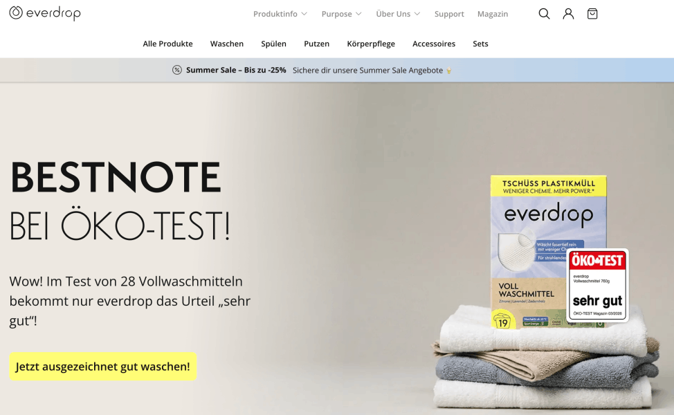
1. everdrop: making the mission visible in the product
German brand everdrop says its goal is to make a more sustainable lifestyle easy enough to become a new standard.
Its range includes household and body-care products. Its company history highlights refillable cleaning products, cleaning tabs and dishwasher tabs without plastic or water-soluble PVA film.
The branding lesson is the close connection between purpose and product design. The sustainability message is not limited to an About page. It is expressed through product formats intended to reduce unnecessary single-use plastic, while the company describes the products as both innovative and stylish.
For e-commerce branding in Germany, everdrop is a useful example of turning a broad value such as sustainability into a visible and understandable customer proposition.
Key lesson: A brand value becomes more credible when customers can see how it affects the product.
2. SNOCKS: a recognisable voice built around the founders’ story
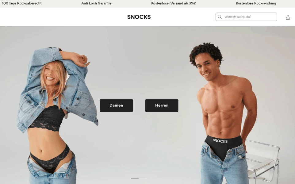
SNOCKS was founded in 2016 by cousins Johannes Kliesch and Felix Bauer after they explored Fulfilment by Amazon and identified an opportunity for affordable, high-quality sneaker socks that would not slip.
The company’s own founder story openly discusses unsuccessful business ideas and a failed early product before describing its later investment in brand-building across social media, video and podcasting.
The story itself uses informal language, jokes and direct commentary. That tone makes it feel like part of the SNOCKS brand rather than a conventional corporate timeline.
The lesson is not that every company should sound casual. It is that a distinctive voice becomes more credible when it is used consistently and supported by real stories.
SNOCKS turns the ordinary category of socks and underwear into content with personality, while keeping the product proposition straightforward.
Key lesson: A consistent voice can differentiate products in a category where the functional differences may not be immediately visible.
3. air up: turning product science into the brand narrative
air up sells a bottle system designed to make plain water feel flavoured through scent.
As the user drinks, air passes through a scent pod and carries aromas through the straw. The company explains that the brain interprets this through retronasal olfaction while the water itself remains plain.
This mechanism is not a technical detail hidden in a product manual. It is the central brand story. The product, naming and communication all revolve around the same core idea: taste through scent.
air up demonstrates how a distinctive product mechanism can become a strong branding asset. The science gives the company a memorable explanation, while the bottle and replaceable pods create a recognisable product system.
Key lesson: When the product has a distinctive mechanism, explaining that mechanism clearly can become the foundation of the brand.

4. tonies: branding embedded in product interaction
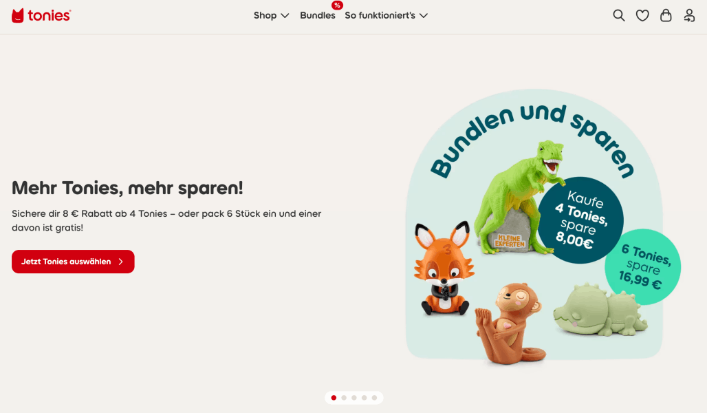
tonies’ core system combines an audio player with physical character figures that unlock stories, songs and other audio content.
The company positions its Toniebox around screen-free play, intuitive controls and independent use by children.
The brand idea is built into the interaction. Children place a character on the box to start listening, while the colourful hardware and collectible figures make the experience tactile and easy to understand.
The lesson is that customer experience can be a branding element in its own right. tonies does not rely only on a logo or campaign. The way the product is used communicates simplicity, playfulness and child-focused design.
Key lesson: A distinctive and intuitive interaction can be more memorable than visual communication alone.
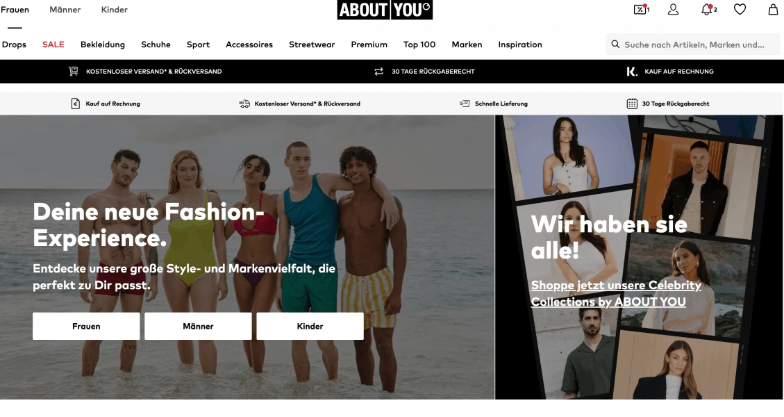
5. ABOUT YOU: making personalisation the organising idea
Hamburg-based ABOUT YOU describes its purpose as turning shopping into a personalised digital experience.
Its app adapts to users, recommends relevant looks and combines fashion, content, community, exclusive labels and celebrity collections.
The company’s name already places the customer at the centre. The wider experience supports that positioning through personalisation, inspiration and individual self-expression.
ABOUT YOU shows how ecommerce branding can be built around a service model rather than a single product feature. The brand promise influences the interface, recommendations, content and commercial partnerships.
Key lesson: A strong positioning idea should influence how the platform works, not only how it is advertised.
What German e-commerce companies can learn from these examples
These brands do not share one visual formula.
everdrop links design to a sustainability mission. SNOCKS relies heavily on voice and founder-led storytelling. air up turns a product mechanism into a memorable narrative. tonies makes the interaction itself distinctive. ABOUT YOU uses personalisation as the organising principle for the shopping experience.
Their common feature is alignment. The positioning is visible in more than one place.
For companies reviewing e-commerce branding in Germany, the most useful questions are:
- Can customers understand the offer quickly?
- Is the brand recognisable without relying only on the logo?
- Do the website, social content, product and packaging communicate the same position?
- Does the customer experience support the promise?
- Is the identity distinctive enough to be remembered but clear enough to use?
- Is there a regular process for reviewing and improving it?
- Has the company tested its assumptions with customers?
Common e-commerce branding mistakes to avoid
The Adobe study and the German examples point to several recurring mistakes.
Treating branding as a one-off design project
A logo launch does not complete the branding process. New channels, products and teams create new applications, and these need to be managed.
Prioritising appearance over clarity
A visually impressive shop can still fail if customers cannot understand the product, compare options or complete the checkout easily.
Using a different identity on every channel
Variation is useful, but the core visual and verbal cues should remain recognisable across the website, marketplaces, advertising, social media, email and packaging.
Copying a popular aesthetic without a clear position
Minimalism, bright colours or founder-led content are not strategies on their own. They work when they support a differentiated proposition.
A visual style that is fashionable today may become dated quickly if there is no stronger strategic idea behind it.
Making purpose claims that are not visible in the product
Values such as sustainability, accessibility or transparency become less credible when they appear only in advertising copy.
Companies should be able to show how their stated values influence products, packaging, sourcing, service or business decisions.
Promising more than the operation can deliver
Branding creates expectations. Poor delivery, inconsistent quality or unhelpful support will weaken trust regardless of how polished the creative work looks.
A strong brand promise must be supported by operational reality.
A practical e-commerce branding checklist
Companies can use the following checklist when reviewing their branding:
Positioning
- Is the target audience clearly defined?
- Is the main customer problem clear?
- Can the point of difference be explained in one or two sentences?
- Are the company’s main claims supported by evidence?
Visual identity
- Is the logo legible at different sizes?
- Are colours, typography and photography used consistently?
- Do product images follow a recognisable system?
- Does the design remain clear on mobile devices?
Brand voice
- Does the language reflect the intended personality?
- Is the tone consistent across product pages, social media and support?
- Are important terms and product claims used consistently?
- Does the writing sound natural rather than generic?
Customer experience
- Is the website easy to navigate?
- Are delivery, payment and returns information easy to find?
- Does the packaging match the online brand experience?
- Does customer support communicate in the same tone as marketing?
Brand management
- Is there a current and accessible style guide?
- Does someone have clear responsibility for the brand?
- Are new assets reviewed before publication?
- Is customer feedback collected regularly?
- Is there a scheduled brand review?
Conclusion
The Adobe findings show a gap between recognising the value of branding and managing it consistently. Many German decision-makers do not review their visual assets regularly, while web design, social graphics and cross-platform consistency remain common concerns.
The answer is not a constant cycle of rebrands. It is a disciplined approach: clear positioning, a usable identity system, coherent digital execution, customer feedback and regular review.
The best examples of e-commerce branding in Germany show that strong brands are not built by appearance alone. They make their central idea visible throughout the product and customer journey.
When the promise, design, voice and experience support one another, branding becomes more than a marketing asset. It becomes part of how the business competes.
Methodology and source note
Adobe Acrobat describes “The most common design mistakes in branding” as a representative nationwide study based on responses from 350 company decision-makers in Germany, collected between 14 and 19 February 2026.
This article combines the published Adobe study and the materials supplied by Adobe’s representative with editorial analysis and examples drawn from the official websites of the featured companies.
Frequently asked questions
Q: What is ecommerce branding?
A: E-commerce branding is the process of creating and managing a recognisable identity for an online business across its visuals, messaging, product, website and customer experience.
It includes much more than a logo. It also covers the way the company communicates, how the online shop works, how products are presented and what happens after an order is placed.
Q: Why is e-commerce branding important in Germany?
A: The German market includes established retailers, marketplaces and direct-to-consumer brands competing for customer attention.
Strong branding can help a business explain its difference, create consistency and become easier to recognise. Adobe’s 2026 study also suggests that many German companies still see weaknesses in web design, social visuals and cross-platform consistency.
Q: How often should an e-commerce brand be updated?
A: There is no universal schedule for a full rebrand. Companies should review key brand assets regularly and after major changes in strategy, audience, products or channels.
The aim is to correct weaknesses while preserving useful recognition. A complete redesign should be based on a clear business or customer need, not simply on the age of the existing identity.
Q: Is e-commerce branding only about visual design?
A: No. Visual identity is important, but branding also includes positioning, tone of voice, product experience, packaging, delivery, returns and customer support.
Every interaction contributes to the customer’s overall perception of the brand.
Q: What makes a strong e-commerce brand?
A: A strong ecommerce brand has a clear position, recognisable identity and consistent customer experience.
Most importantly, the business delivers the promise communicated by its branding. The product, service and operations must support what the visuals and marketing claim.
Q: Can a small e-commerce company build a strong brand?
A: Yes. A strong brand does not require the largest advertising budget.
Smaller companies can begin with a clear target audience, focused positioning, consistent product presentation and a distinctive tone of voice. Consistency and clarity are usually more important than producing a large volume of creative assets.