How Do One-Page Checkouts Influence the Process of Online Shopping?
Written by
Editorial TeamPublished on

In recent years there has been a great development in shopping online rather than actually leaving the house on the hunt for your everyday necessities. Naturally so, since humanity is always a big fan of making life easy as can be, shopping online is just a given development as it doesn’t require leaving the house, standing anywhere in line, or having to deal with traffic – and all that in the small time frame of opening hours after most people already master a 40h job weekly. Among other things.
But what is the secret recipe that makes online shopping a success, meaning customers that actually fulfill the process of checking out and paying, rather than abandoning their virtual shopping carts?
The magic word you are looking for is One-Page-Checkout. Now, you may ask yourself, how does a Checkout, simply contained on one page, influence the process so drastically? Continue reading and we will gladly tell you how. But first, let’s have a look at how it all started…
Evolution of Online Checkout Processes
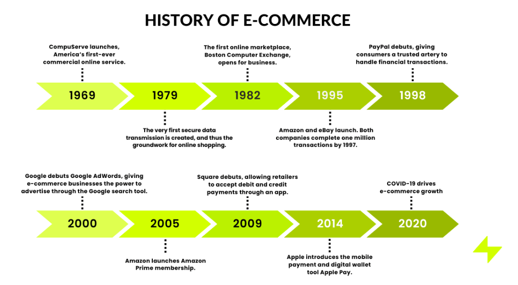
Contrary to general belief, online shopping did not just start with the beginnings of the Internet but already had its first appearance in 1982, when the first online marketplace opened for business. Since then, a lot has changed. Traditional Checkout Methods faced a lot of challenges which would indeed impact the overall shopping experience. Below we have listed some of the issues, traditional online shops had to face over time:
- Very complex, very long
Traditional check-out processes often require many steps, for all the important data and navigation through multiple pages. This would frequently lead to frustration and impatience, increasing the likelihood of abandoned shopping carts with no return ever.
- The requirement to registration
Usually, in order to be able to purchase from a website, it used to be required to register. That meant thinking of a username, creating a password, and all the hassle that came with it. The outcome? You would now be a member of yet another website, with yet another bunch of login information you shouldn’t forget – though many customers rarely want to create an account, especially when it might be a one-time purchase. This is where everyone’s best friend, the “guest checkout” strikes in action nowadays.
- Want to pay but your option is not available?
The Dilemma was this: You found your desired items and were about to pay and fulfill the purchase, when you discovered that only a specific card or payment method was available. A limited range of payment options not only would shy away customers who prefered a specific method of payment, but also made the online shop seem less trustworthy.
- Talking about trustworthiness…
Sometimes customers would have security concerns regarding their personal data due to opaque forms and processes. If no clear information was given on how the required data would be handled, fear of data breaches or even identity theft could lead to a loss of trust in the online shop and therefore abandonment of shopping carts.
- Lack of transparency
Nothing is more annoying than buying a pig in a poke. A lack of transparency during the checkout process in regard to additional costs or shipping fees has led to more than one customer leaving the website, annoyed and frustrated. Nobody likes surprises when they affect your finances.
- No Mobile Optimization
Traditional Checkouts would not support the use of mobile devices since they simply weren’t in the picture yet. Shops that missed the change into modern times, which are characterized by an increased use of smartphones and mobile devices, would be avoided by customers. The poor user experience drastically hindered conversions.
- Excluding International Aspects
Running a successful online shop requires thinking outside the box and not forgetting about customers who might not live in the region. Traditional checkouts would often not consider the change of currency and shipping information and therefore limit the overall reach of the online store. Just imagine you want to purchase that pullover with the perfect witty slogan for a slow Monday morning in the office but you don’t know if there are shipping costs or if there is an additional fee.
- Not capturing impulse purchases
All aforementioned issues created another issue: not capturing customers who are on an impulse shopping spree. Anything that slows down the process would kill the “I need that” thought and give time to form another sentence: “Do I really need that?”. To apprehend these more than welcome customers, it was necessary to move on from traditional checkout processes and develop something more prosperous: The one-page-checkout.

(Source: BIGCOMMERCE, “E-commerce: The History and Future of Online Shopping”)
The Emergence of One-Page Checkouts
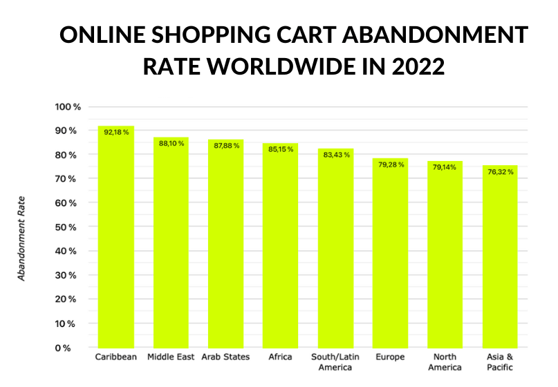
In regard to the previous points, you will have realized, that modern-day checkouts usually differ from what used to be traditional checkouts. E-Commerce evolved rapidly over the years, always considering the best solutions to increase conversion rates and avoid the abandonment of shopping carts. The latter should not be underestimated, as there are studies proving that shopping cart abandonment is a phenomenon, which happens throughout the world.
The checkout process itself plays a major role if customers actually go through with the purchase or quit. And if they have to face hurdles and inconveniences along the way, they might not even start the process at all.
The most effective way to deal with this problem is to implement a One-Page Checkout, often also called single-page checkout.

“Online Shopping Cart abandonment rate worldwide, in 2022” (Statista, Nov 20, 2023)
But what exactly is a One-Page Checkout?
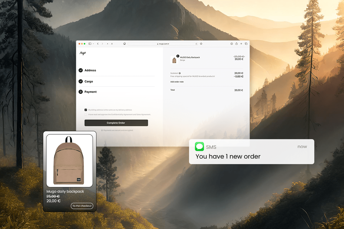
A one-page checkout is characterized by a streamlined and condensed purchasing process that combines all necessary checkout steps on one single page. Full transparency, no complexity and a very convenient user experience, paired with a clean and modern look – one-page checkouts are the optimal solution to make the shopping experience for your customers a nothing but positive experience by reducing all possible frictions in the purchase journey.
And what are the advantages?
There are multiple very convincing reasons why one-page checkouts are being adopted by nearly all modern online shops and we as ikas, a new generation e-commerce platform, can absolutely recommend so as well.
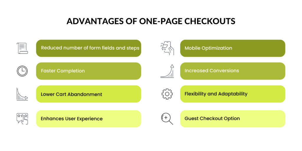
First of all, who doesn’t like a smooth, easy shopping experience? The fewer form fields and page swaps, the better! It saves you time, and nerves and you won’t run the risk of losing the overview. Speaking from a psychological point, it reduces the amount of cognitive load and makes shopping more effortless and enjoyable – which in return will lead to positive brand recognition and increases the likelihood of returning customers. A generally enhanced user experience, for example by offering the option to order as a guest, automatically leads to lower cart abandonment and therefore increased conversion rates. And don’t forget about mobile optimization! Mobile Commerce continues to grow and it is very important to ensure a user-friendly checkout experience for users of smartphones and other mobile devices. A one-page checkout is naturally designed to be mobile-friendly.
These are just a couple of reasons for the importance of one-page checkouts. Since there are always two sides of a coin, you might ask if there are known disadvantages. A common challenge which is often criticized, is finding the balance between simplicity and the necessary information. As convenient a clean look may be, if there is crucial information missing the whole concept becomes a failure. Also, some people might state they feel overwhelmed with having to fill out all the information at once. In the end, this is exactly what determines whether your checkout process is successful and accepted by people – or not.

Implementing One-Page Checkouts effectively
Now you may be wondering how to get there. If you happen to have an online shop yourself you might want to check out ikas. ikas focuses especially on making e-commerce an easy and pleasant experience for shop owners, as well as their customers. If you are not necessarily familiar with programming, our e-commerce platform is your best choice – it requires little to no prior knowledge and our customer support will always be by your side. Our one-page checkout offers you a clear page. You have design options to adjust the look of your checkout, you can connect important payment methods such as PayPal, Klarna, Stripe (and much more) and you won’t have to worry about customers from all over the world, as currency and shipment information adjust automatically.
Long story short: The benefits of the Implementation of one-page checkouts predominate by far the minor disadvantages. So if you are interested in making the most of your e-commerce experience, both for yourself and your customers, a one-page checkout might be a big step towards your success.
About the authors
Article by Anja Marb | Content Marketing Specialist | ikas
ikas is a new-generation e-commerce platform specifically developed for SMEs and large companies. With ikas, you can effortlessly create your own online store in just three simple steps, all without the need for any technical knowledge or expertise.
If you want to know more about how to improve your existing online shop or are even completely new to the topic, ikas provides you with top-level customer support who is always happy to help out.
***


