Shopping at your fingertips – the state of mobile commerce in germany
Mobile Commerce is on the rise in Germany; climbing to ever higher growth rates in one of Europe’s biggest markets. However, latest statistics on device usage show that mobile success cannot be taken for granted – and that there is an even bigger growth spurt yet to come.
Beginning of this year the We-are-social report “Digital in 2017” gave fresh insights about digital usage and activities in many countries all over the world. The comparison to other nations is particularly valuable to business analysts and managers in charge of online/offline retail strategies.
In times of fast market development and quick changes of digital habits strategies have to be reviewed and checked regularly. The customer journey became highly unpredictable, so we all have to watch our clients and similar markets closely to learn who they are and who they become.
A digital mature population
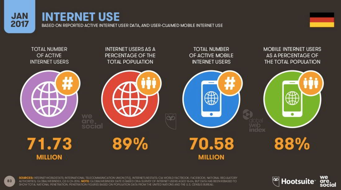
As one of the leading digital nations Germany is in 2017 again on top-6-position worldwide with 89% of the total population being online. Over the last years the country established its position in close neighborhood to South Korea (90%), Canada (91%), UK (92%), and Japan (93%) following the internet-leader USA with a staggering 99%.
Considering social demographics (https://service.destatis.de/bevoelkerungspyramide/) and taking into account that Germany is also in the digital field struggling with an ageing population, it is fair to say that the spreading of internet is close to reaching its limits.
The numbers of internet usage might or might not increase by one or two percentage points – if at all: the internet penetration in Germany is well advanced. Growth can no longer happen by new target groups discovering the internet – they are all already active online.
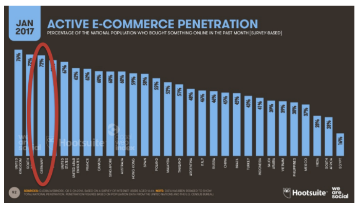
In fact Germany with its 72% is on position 3 of the most active e-commerce populations worldwide 72%; same as South Korea with equally 72% and right after the UK with 77%.
Meaning: Digital economic growth can and will happen if and only if the 72.73 million internet users will be interacting even more. And it seems as if they will.
Massive mobile boost
This is confirmed by the fact that indeed the total amount of internet users did not grow between January 2016 and January 2017. But there is an impressive two-digit growth (+17%, an absolute number of 4 million users!) in other digital channels, such as social media and mobile!
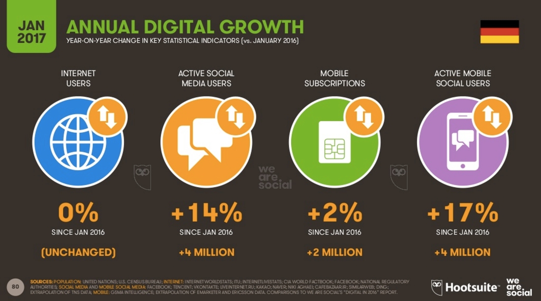
So while there was no change in how pcs or laptops are integrated into daily live, since last year 4 million more people chose to get a smartphone and use it for their social interactions. This is indeed a massive growth in an already mobile and digital conscious market.
Where’s the money?
But funny enough this mobile growth is not mirrored by actual mobile purchases: meaning a checkout on the mobile device.
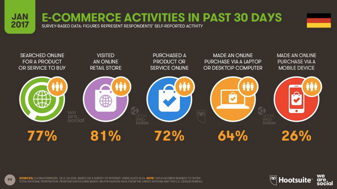
With only 26% of people actually buying from a mobile device’s screen Germany is far behind its digital advanced peer group that we saw in the comparisons on internet usage and e-commerce.
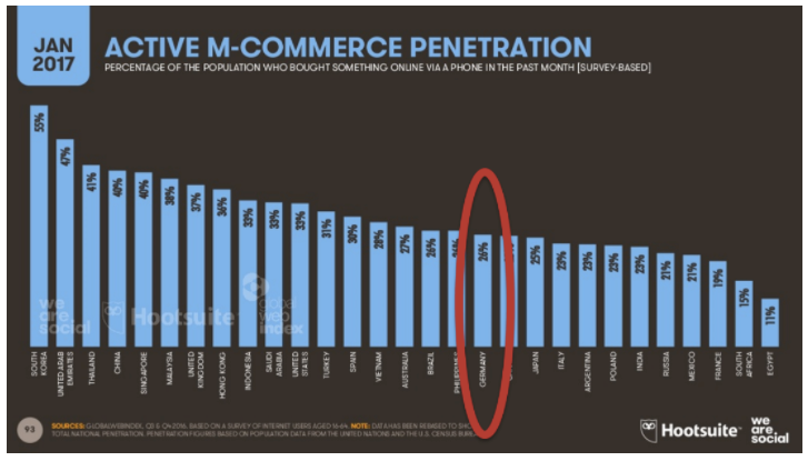
We would expect to have similar numbers of usage in the mobile segment, too. Even more so if we keep in mind that last year’s growth spurt was only in the mobile segment while other numbers stayed equal. But why?
As the digital purchase activity is high, and mobile usage is high too, an obvious conclusion is that people actually try to buy on mobile devices, but it simply does not work for them!
Money flows where user experiences leads it to. Spending money is always a matter of trust, so people are very sensitive if a digital purchase experience does not turn out as expected. They follow the saying: “if it doesn’t open, it’s not your door!” And will go buy somewhere else.
In short: mobile commerce numbers in Germany are comparatively low not because people don’t browse with a purchase intention when mobile – they do! But they stop at some point in the process because it is still hard for them to do the checkout.
From mobile minimum to *really* understanding the user
If this explanation is correct, it equals to a strong call-to-action for all digital represented companies, designers and service providers: make it easier for the people to shop on mobile!
Don’t copy the content and procedures to a different screen size! If an online shop is accessible through a mobile browser, it does not yet mean, that it is usable.
Pages are often too full, visuals don’t work on smaller scale or have to be scrolled to fully grasp them. Fonts and buttons are not adjusting and too small to be read. Attention is not focused and guided, checkout steps take too long to load. Forms cannot be filled and buttons cannot be clicked by anything bigger than a baby-finger. And that’s just a few things about the template. All these problems can be avoided with the use of a responsive web design that automatically adjusts to different screen-sizes of the browser.

But a responsive design is not yet the end of the story. An online shop can be responsive but still fail to show its full potential on the device in question.
All texts and visuals have to be well-chosen to meet the target group’s mobile expectations. Next level is the question of how to guide the customer’s attention and make him stay and interact. Due to the little space on screen, the navigation is often reduced and hidden behind the meanwhile standard three-bar-icon called the “hamburger menu”. The problem is: once it is out of sight, people don’t use it to browse and interact. If the start screen is not seducing to dive deeper into the shop they will leave soon.
Does this all matter?
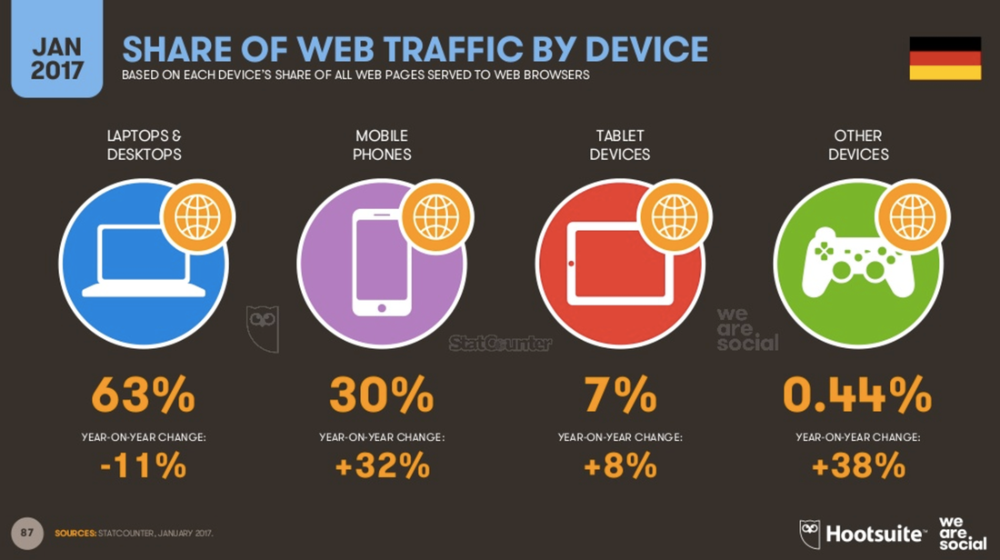
All this would be not as urgent a topic if customers would stay loyal to the desktop and would only browse on mobile occasionally. But numbers prove otherwise. In fact the web traffic of laptops and desktops has fallen within 12 months by -11% while that of mobile devices grew by the huge number of 40% (32% phones + 8% tablets).
But can’t we be relaxed about the question from which device the client is going to place the order? No, we cannot. The user’s clear preference is mobile.
The smartphone is meanwhile deeply integrated into our daily life and fast at hand. Customers want the mobile channel, and they will use it. If they are unsatisfied with your offering they will turn to a competitor’s, if that one works well. Or else they will increase their purchase volume on the big generalist platforms with high quality of service and well-working mobile apps like amazon.
Top Five ‚DO’s in mobile commerce
- Go responsive, even if you are offering a native mobile app, too! People search for products and services on mobile, and they should be served.
Offer a mobile manageable design and be creative about it! - (Remember: the hamburger menu icon is widespread but not the ideal solution to navigate.)
- Offer a genuine advantage that makes the customer enjoy the mobile format and come back!
- Work your content and make your customers feel at home, understood, and properly addressed on all devices.
- Multi-channel or online pureplay – do what is best for your business when it comes to integration of other channels; but do it consistently and with a sound business model and strategy that pays attention to user experience and additional services.
Sources:
https://www.slideshare.net/slideshow/embed_code/71406287 (EN, Digital in 2017: Western Europe)
https://wearesocial.com/de/Special-Reports/global-digital-report-2017-digital-ist-deutschland (DE)
OXID eSales (Reponsive Visual)

Author:
Caroline Helbing is a business analyst and content writer at OXID eSales AG. In 2007 she joined OXID eSales, an open source eCommerce company. Caroline has a profound background in product management and communications. In her current role she analyzes and evaluates trends and markets with regard to growth impulses and industry-changing technologies.