The importance of checkout design and four best in class examples
Arguably, there isn’t a single page on your website that rivals the importance of your checkout page. If a customer has made it to checkout, they are right on the cusp of making a purchase. Therefore, if it proves too complicated or long-winded, they can easily decide, in a flash, that actually this product isn’t for them.
It doesn’t matter if you’re a pure D2C company or an omnichaller retailer, after you’ve put in all that effort and marketing budget getting users to this stage the last thing you want is to give them any reason to abandon at this crucial stage.
On average, almost 70% of online shopping carts are abandoned before checkout. So, to help maximize your site’s conversions, we’ve had a look at some of the leading examples of flawless checkout design from the biggest eCommerce sites in the world.
From each site, we’ve picked out one thing they’ve done particularly well. By building an understanding of what makes a checkout page successful, we hope you can absorb these lessons and apply them to your own business.
And, hopefully, by the end of the piece, you’ll have a clear idea of what makes a successful checkout page.
Why checkout design is important
Up to the point of a user entering the checkout funnel, you’ve done everything right. Your marketing has worked, your website design and navigation have led them to this point and they are ready to make a transaction.
However, if your checkout design is poor, all that effort goes to waste.
Baymard data reports that nearly 1 out of 5 shoppers have abandoned a cart in the last quarter due to a “too long/complicated checkout process. So while it does happen, there are actions you can take to actively try to avoid it, or at least reduce the amount that abandon during the checkout process.
When it comes to a good checkout design, it’s critical the user experience is as seamless as possible. If your product page has conceived them to add to their basket, you need to guide them effortlessly throughout the steps all the way to conversion at checkout.
Essentially, you want to avoid giving the user any reason to leave. So, have a nice layout, don’t hide shipping costs, offer enough payment options, and use the right CTAs. Everything you need to optimize here should be done with the goal of reducing the time and effort it takes to complete the checkout process.
These 5 examples all do that and more.
Five best in class examples of checkout design
Amazon
Amazon has slowly but surely established its position as one of the world’s most valuable companies. Through intermediaries, they sell products of all shapes and sizes in almost all industries. Sometimes, you know you can get a product for the same price as on Amazon but it won’t be as straightforward a process – from adding to your basket to confirming your payment details.
A huge, often underappreciated part of Amazon’s sustained growth is the beauty of their checkout design. Add a product to your basket and Amazon will alert you at the top of the page – outlining your pre-checkout order. It’s a pared-down look at all the important parts of your order: the name of your product, an image of the product, the quantity of the product as well as its price.
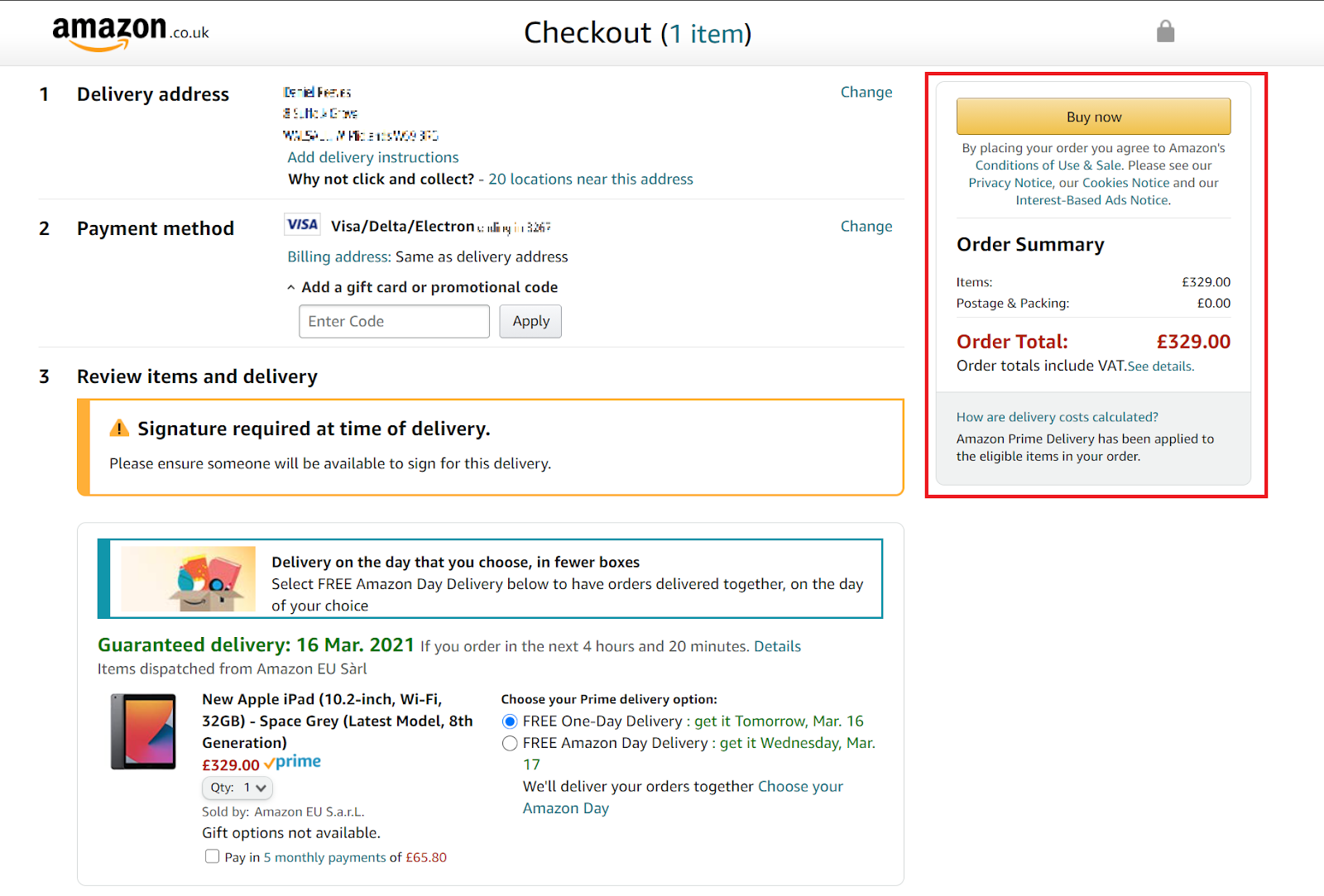
When you get to the checkout page (as above), it distills all of the constituent parts of an order into a single, uncluttered page. You can review your delivery address, your payment details, and the product and its expected delivery date in a single glance. There is still a great deal of white space and an uncomplicated structure that makes it easier for the customer.
The highlighted section on the right is also “sticky” so if you have multiple products in your basket progression to the next stage is always a single click away and within your eye line at all times.
The beauty of Amazon is once you’re logged in, checkout can be completed with a single click or 2 steps as all your details are saved. Is there an easier checkout process around than this?
ASOS
Ecommerce sites have been some of the biggest beneficiaries of the pandemic and ASOS is no exception. The closure of physical shops has forced shoppers to go online to satisfy their spending habits and the ASOS site is carefully crafted to scoop up all the unexpected extra attention.
Part of ASOS’s appeal is its pared-back design. It’s monochromatic throughout, which makes any colors that are present in featured products really pop.
They also do a good job of reminding you what’s in your cart while you shop so you don’t have to click around to determine exactly what you’ve added. I can’t count the number of times I’ve had to cycle through the pages I’d already visited just to confirm exactly what I was purchasing. Pressing back on your browser also has the effect of completely restarting or even canceling the progress of your order – magnifying the sense of confusion.
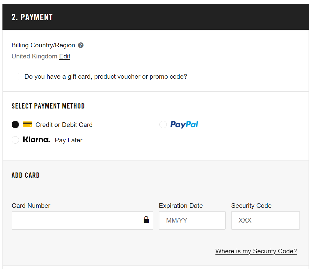
What I want to highlight about ASOS however is their attempts to make the security of their checkout process stand out. When you’re focused on maximizing conversions, security is an easy aspect of checkout design to overlook.
Whenever I buy anything, I make a mental note to glance at the site one more time to see if there is anything even slightly suspicious or out of the ordinary about it. Spammy, busy sites inundated with popups and special offers can be difficult to trust. You are putting your faith in an eCommerce site when you provide them with your payment details and you want to be certain that your faith isn’t misplaced.
This is what makes ASOS’ checkout design so comforting. It’s almost bare apart from a concise breakdown of your order and a big Norton security insignia. It gives customers much-needed peace of mind.
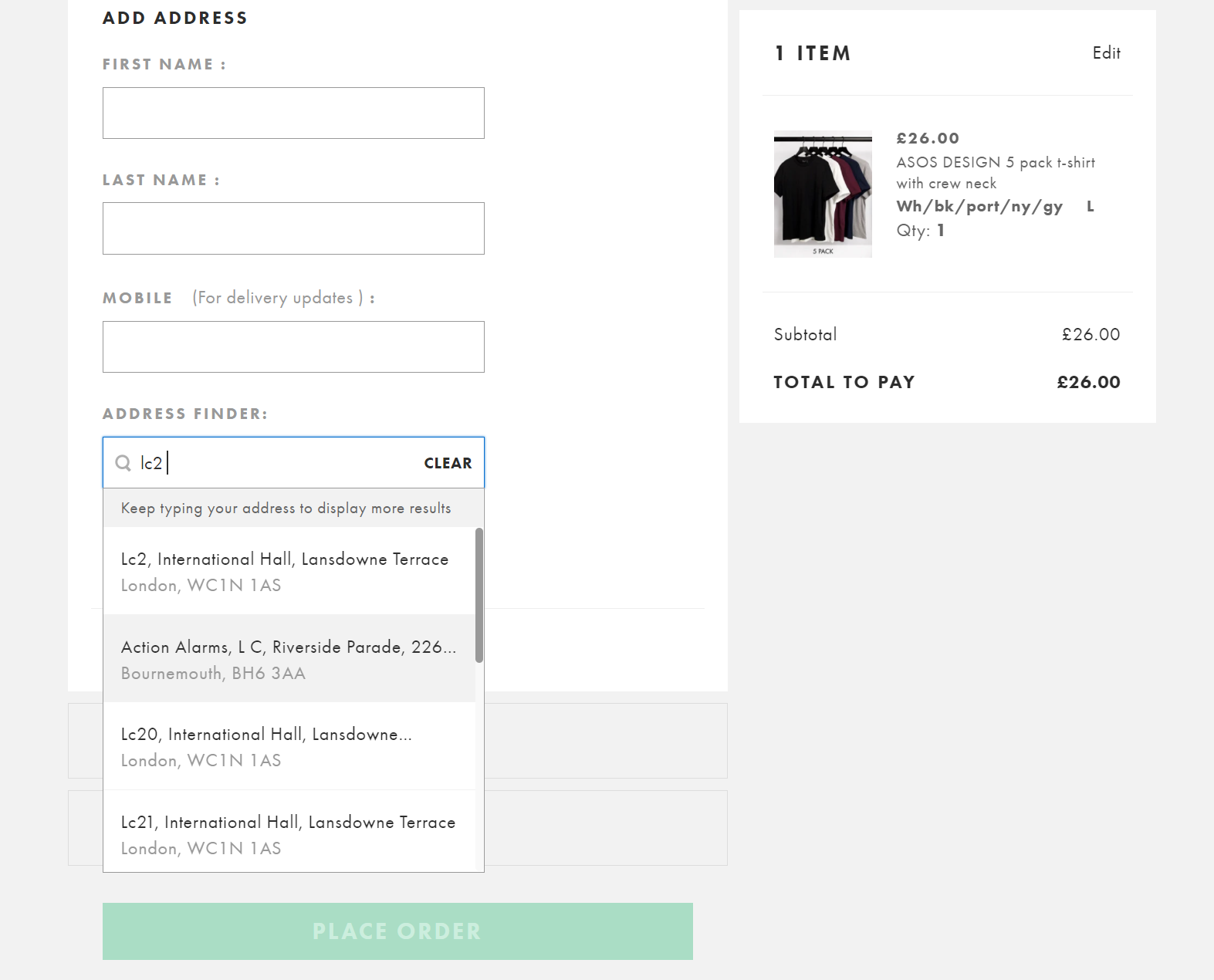
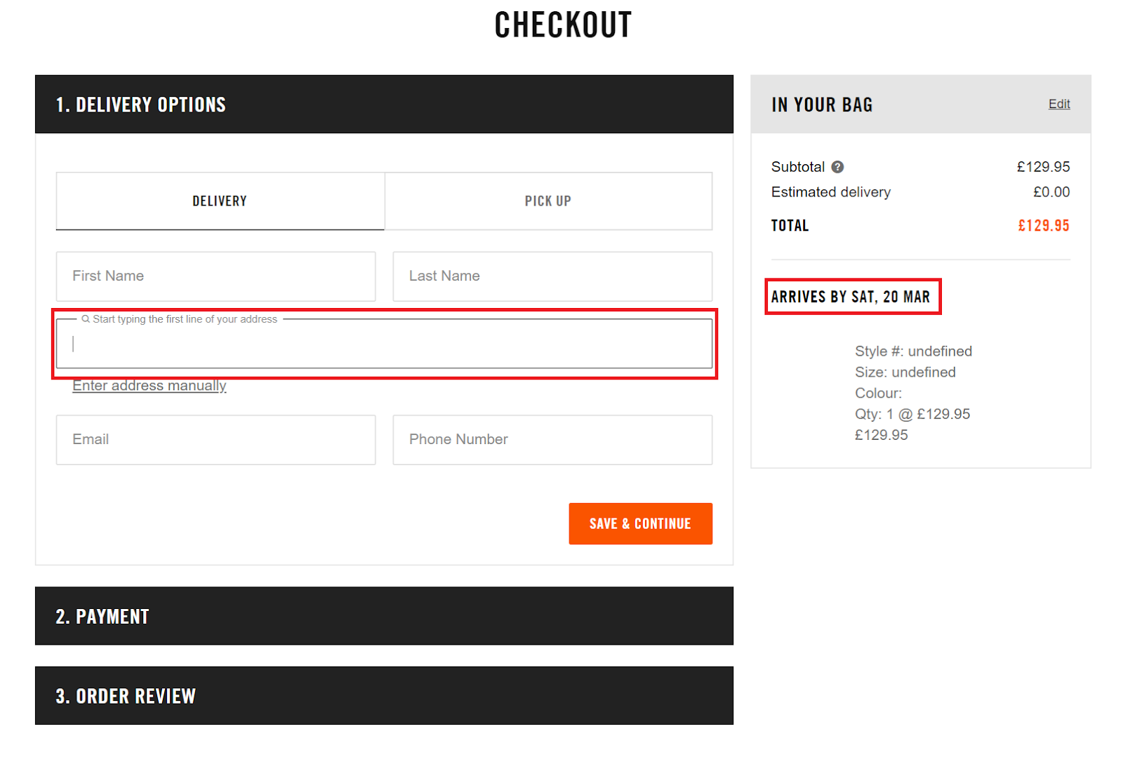
ASOS also uses various different functionalities to make their checkout process as seamless as possible. From offering, address lookup during the personal details page:
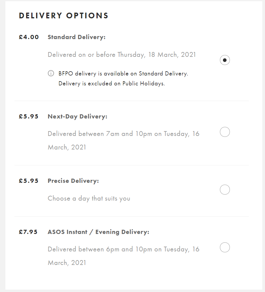
To clearly showcasing multiple delivery options which can be easily selected:
During the whole checkout process, your order summary is still nicely floating at the top right corner. This helps keep intent high as users can clearly remember what they are buying and how much they are spending. Reducing the need to hit the back button, or return to the basket to find out.
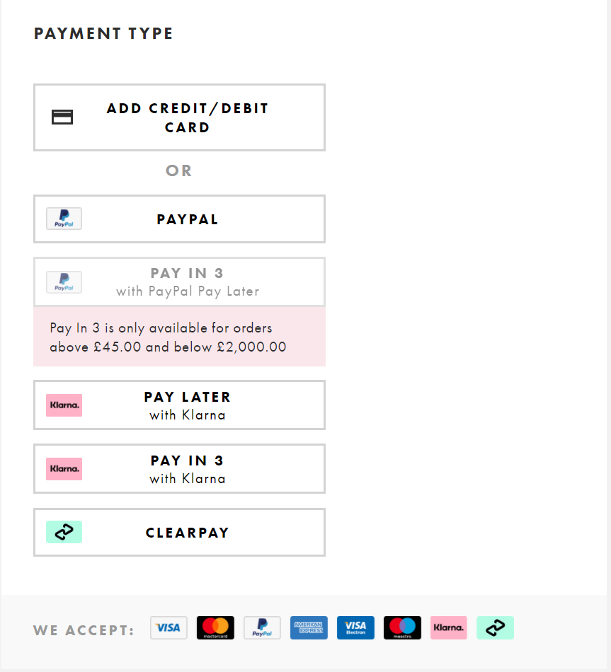
And finally, you are greeted with a plethora of payment options to make things even easier. ASOS was also one of the first major eCommerce websites to sign up to Klarna and offer staged payments.
What’s interesting about the ASOS checkout journey is that it all takes place on one page. There are no steps highlighted, just a seamless scroll down to the next section to fill out. This makes the checkout process seem a lot quicker and shorter, avoiding the potential issues of “long checkouts”.
Nike
Nike is one of the world’s leading retailers. From sports performance clothing to running shoes, Nike has a reputation for creating high-quality products. They’ve been able to maintain their reputation by establishing a sleek, refined, and simple online presence. Their checkout page is the perfect representation of this. It puts the customer first and doesn’t try to overburden them with additional offers.
A strength of their checkout design is the option to checkout as a guest. Potential customers can get frustrated with being prompted to create an account at the point of checkout. Interestingly this isn’t something that either ASOS or Otto allows you to do.
Creating an account is another unnecessary obstacle that can frequently prove too steep for them to overcome. While it’s understandable for businesses to request an email address for marketing purposes further down the line, it can be so off-putting as to stop the customer dead in their tracks. They can quite easily go elsewhere to make their purchase.
Customers are not naïve about their data. They understand that their details are going to be exploited for commercial gain. By agreeing to fill out all their details, they recognize that they are also signing up for a future of promotional offers. Why not try to offset that risk by providing a simpler, faster, less invasive guest checkout process?
Due to this guest checkout first approach, Nike benefits from a very quick and easy checkout process. As soon as you click that checkout button there are only 3 steps left. Comparing this process to ASOS, this also takes place on one page, with a stick order summary on the right-hand side.
Nike also uses an automated address lookup which makes things a lot easier for users. Delivery costs and timeframes are also clearly highlighted. Once you’ve quickly filled out the required forms you’re onto payment details.
The only difference vs ASOS here is that Nike doesn’t offer Clearpay as a payment method. Card details are grouped into one type rather than splitting out credit or debit, with PayPal and the now ever-present Klarna also available.
Nike’s checkout process is very similar to that of ASOS, with the one major difference being the guest checkout first approach.
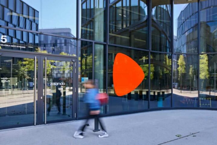
Zalando
Germany’s third biggest online retailer, Zalando, is based in Berlin and sells fashion and lifestyle products to customers in 17 different markets.
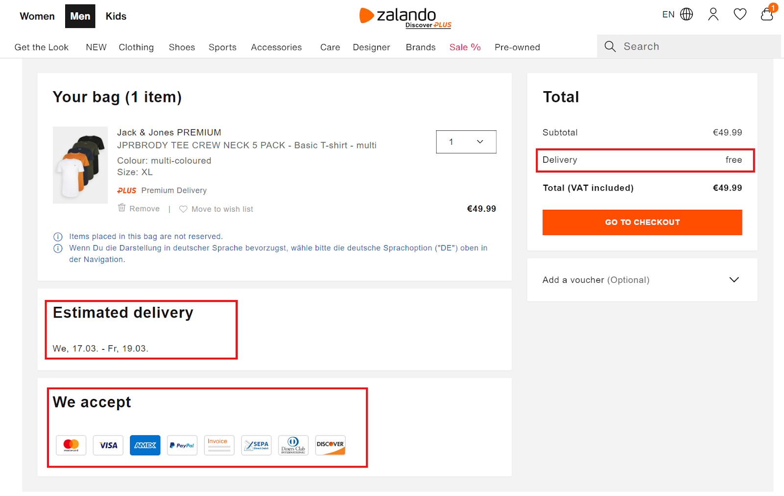
In a similar fashion to the aforementioned eCommerce sites, Zalando makes a concerted effort to reduce the checkout process into its rudimentary parts. When you go to checkout, you’ll be greeted by plenty of white space, basic instructions as well as a secure payment certificate.
Their basket page straight away addresses potential conversion blockers. Delivery time and costs are clearly visible, and they highlight payment options.
What’s most notable about Zalando’s checkout design is the clearly demarcated steps in their checkout process. Numbered 1 through 5, each step has a different label – from ‘login’ to ‘done’ – giving customers absolute clarity on where they are up to in the checkout process.
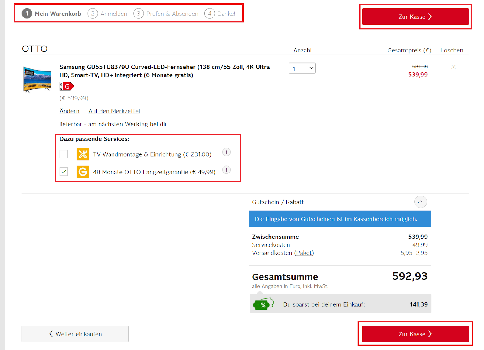
Otto
Otto first started out as a mail-order company in 1949 and then became a thriving e-commerce organization becoming one of the largest in Germany. It now operates in over 20 countries across Europe, Asia, and America with an estimated monthly visit count of over 57 million.
With that many visitors per month, you need to have everything about your checkout process nailed down. And they do.
As soon as you add a product to your basket you’re shown how many steps are left in the checkout process, and we’ve also highlighted some subtle but nice cross-sell attempts. What’s interesting is that Otto uses two checkout buttons. One above the fold, and one below.
Something that Otto doesn’t do as well as the others is allowing you to select a payment method easily. Once you have created an account (no guest was checkout available) you’re taken straight to a review order page like below.
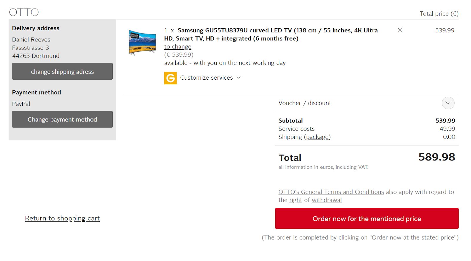
Upon clicking order now it results in an error due to not selecting a payment method. You can see on the left-hand side this was automatically selected as PayPal, but no PayPal details were entered. If other users are encountering this issue it could be causing a lot of confusion and frustration so it’s definitely an area where Otto should review its process.
Closing thoughts
Ultimately, from analyzing a number of well-designed checkout pages, the one thing they have in common is simplicity. By reducing the number of hoops customers have to jump through to buy a product, the more likely they are to click buy. It’s as simple as that. Whatever platform your website is built on make sure it has the capability to adapt and tweak its checkout process easily. As you will definitely want and need to test and change things over time.
One page checkout journeys and guest checkouts definitely seem to be the easiest way to do this and are being adopted by two of the biggest eCommerce websites in the world. Hopefully these reviews have given you some food for thought. Best of luck optimizing your checkout process!