Top 10 Mistakes to Avoid in eCommerce Search and How To Do It The Right Way

We’ve all experienced the frustration of trying – and failing – to find the right product in our favorite ecommerce store. Why can it be so difficult to find the products you already know you want to buy?
Here’s why:
61% of all sites perform below average on site search tests.
These poorly performing sites often repeat these common errors:
- 61% only show results if shoppers use exact matches to their jargon phrases
- 70% of (desktop) eCommerce search implementations are unable to return relevant results for product-type synonyms
- 27% of sites show confusing or useless results if a single character is misspelled
We’re going to show you the top 10 mistakes and then give you some proven ways to get your site search right. Site search rookies and veterans will all find something useful to put into action on their sites.
Mistake #1: Hiding the Search Box – This Confuses Users
Users feel frustrated when they want to search and cannot find the search box. Complicated eCommerce sites with thousands of products should never make their search boxes hard to spot. Your customers will hate it.
Instead, position your site search box in a common location, make it obvious, and show users what to do with it.
Here are some simple tips for making your search box recognizable:
- Don’t crowd it with other elements. Build a little space around the search box. Try to avoid placing other buttons, like newsletter sign-ups, right next to it.
- Use a symbol. The magnifying glass 🔍 is easy to spot and people know it means search. Use it. If you don’t like this, use a little GO→ icon.
- Create a text field. An open text field invites users to search. If they get into your site and feel lost, they can always type something in the search box to take their next step.
- Make the action predictable. People expect pressing enter to execute a search. Other people want to click the search button. Whatever method you choose, make the process as clear as possible.
- Don’t overcomplicate site search. Place your site search button in a ‘normal’ spot, like the center of the page or the top right of the header. Don’t make people hunt for it.
Keep it simple. Don’t make people search for your search box.
Mistake #2: Taking Away the Search Box – This Leaves Users Stranded

Why would you remove the site search box? There doesn’t seem to be any positive reasons for such a terrible action and yet sites do it all the time.
Here’s why removing the search box is such a bad idea:
People navigate sites by searching.
They don’t care what’s in your fancy header or menus. They search for what they want and then they buy it. The search box is a constant navigation tool for them.
If you remove the search box when someone leaves your homepage, then you effectively force them to navigate your site your way, not theirs. This will make them frustrated, causing them to have a bad experience, and they will eventually leave.
Here’s an example from real-life:
Ever been in an IKEA store and wanted to go back to something you forgot? The one-way navigation seems like a great idea until you want to skip around to something specific. Then it becomes restrictive, confusing, and annoying.
Don’t do that to your visitors. Keep the search box on every page.
To make this work better, here are some tips:
- If the location is constant, then you can use an icon without a text field to save space on internal pages. Your homepage trains the customer where to look to launch a search.
- Don’t put a search box on your checkout page because this is the only page you want to keep visitors on for as long as possible.
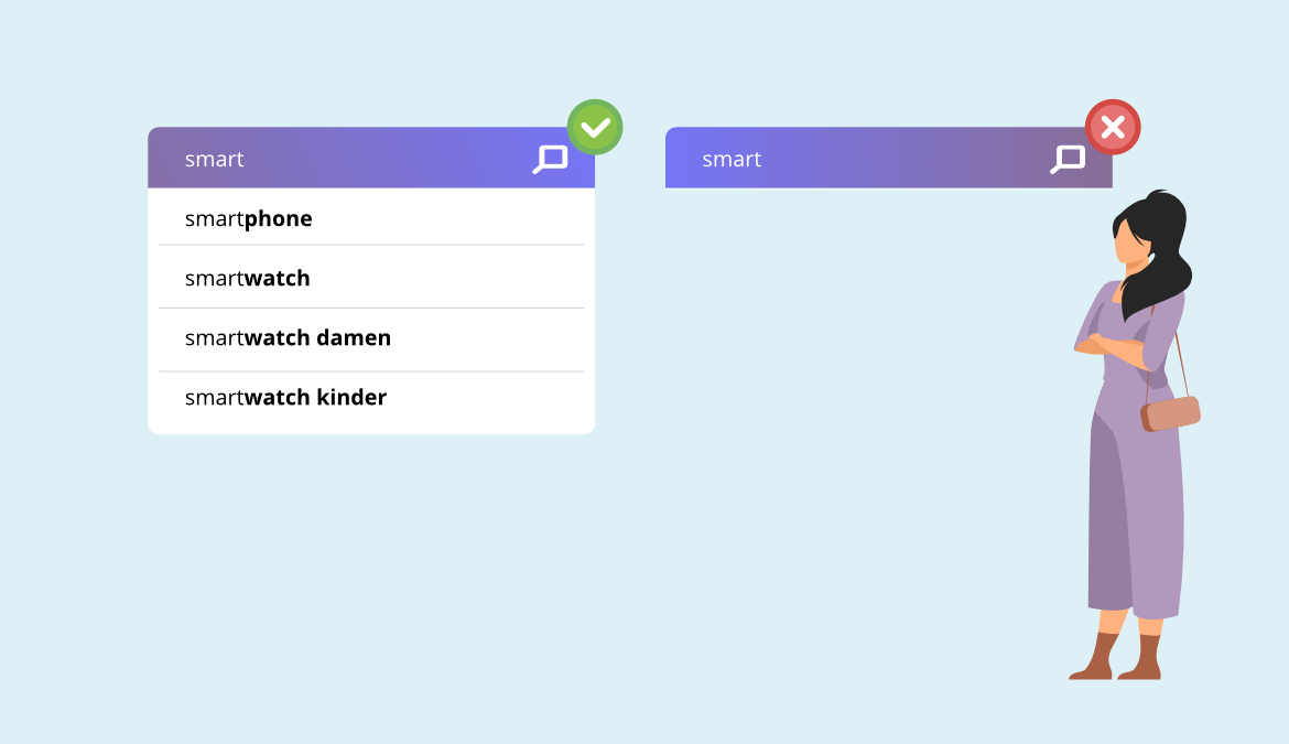
Mistake #3: Not Implementing an Autocomplete Feature – It Makes Users Work Harder
No one has ever done a poll to see if people love typing in search boxes, but here’s what the research shows us instead:
25% of people will click on a suggested search term.
From the customer’s perspective, autocomplete is like magic. They type in a few letters, like “sh” and the site shows them relevant choices like shirts, shoes, or shorts. They instantly see a shortcut to their goal.
Here are some ways to make autocomplete, or predictive searching, work for your site:
- Rank your suggestions carefully. Use behaviour tracking or commonly searched terms to choose suggestions. You will only show the visitor 3-5 suggestions, so getting them right is crucial.
- Use personalization to customize the suggestions. Three basic personalization factors are location, language, and history. Try to use all three to improve results.
- Highlight autocomplete suggestions. Use different colours, fonts, or characters to show customers the difference between what they typed and what your site suggests.
You can check out this article for a complete guide on using predictive searching to improve UX.
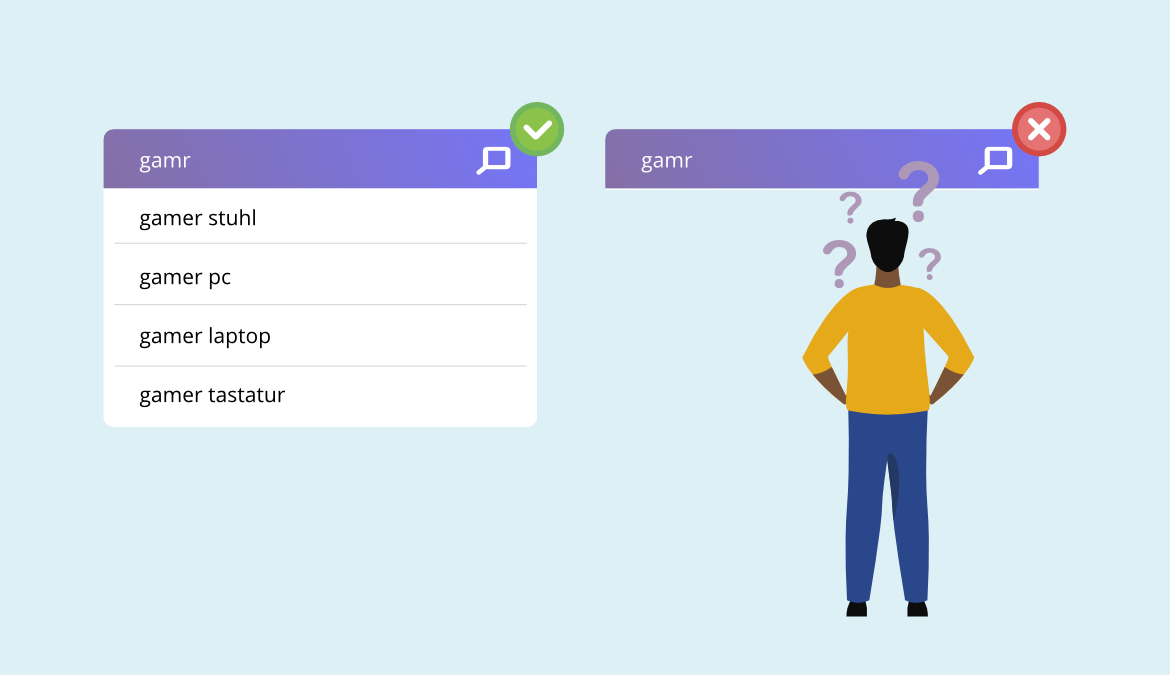
Mistake #4: Weak Error Tolerance – It Irritates and Interrupts Customers
Everyone makes mistakes when they’re typing – especially on mobile devices. If your site search’s error tolerance is weak (meaning it can’t handle typos very well), then you are going to irritate your customers.
Even worse is that you interrupt their journey towards a purchase by forcing them to correct mistakes.
Here’s another stat you should get fired up about:
34% of the top 50 sites don’t return useful results when the user misspells even one character.
When searches don’t return results, users are confronted by a zero results page, one of the worst experiences a shopper can have.
To avoid this, use an error-tolerant autocomplete and continue to optimize it. Here’s how:
- Manually look for zero results searches in your analytics. Try to match the search term containing an error to a useful page to help the next person.
- Use a site search provider that can do some of this for you using AI and machine learning.Train your site search to recognise and handle errors and typos. Your visitors will reward you with more sales.
Mistake #5: Tiny Search Boxes – These Frustrate Long-Tail Searchers
After going through the trouble of providing a nice search box on your site, why would you limit it to a few characters?
Here’s why this is a terrible idea:
Long-tail searchers have the highest purchase intent.
Those people who want to type five or six words into your search box already know what they are looking for. If their text disappears as they type it, they could feel confused, annoyed, or unable to see their query mistakes.
Instead, here’s what you should do:
- Provide a large text field size for users. Ever seen Amazon? Their search bar takes up almost the entire width of a desktop screen.
- If you’re designing your mobile search, you can provide a lot of space in the text field or consider using a pop-up search function to give more space when someone clicks on the search box.
Whatever you do, cherish those long-tail searchers. They know what they want, right down to their size, category, or product details. Give them space to tell you what they want and they will buy it from you.
Mistake #6: Missing Product Previews – It Costs You Sales
When someone types a query into the search box, you could show them products right away.
Here’s how this could work:
- The user starts typing “laptop b…”
- Your autocomplete suggests laptop bags.
- Based on personalization, your site search knows the user is a woman.
- Right in the search box, the user sees the three laptop bags bought most frequently by women.
Can you imagine this from the customer’s perspective? They will feel like you have just read their mind, saved them time, and showed them useful results.
Clever eCommerce store owners use these previews to nudge shoppers gently towards making a purchase quickly.
Set your autocomplete up to show product suggestions in the search area. Your customers can find what they want sooner and your conversion rate will go up.
Mistake #7: Not Using Starter Text in the Search Box
What is starter text? This is the simple text that shows in the search box before the customer types anything. It’s usually in a lighter colour and doesn’t stand out too much.
You may not have noticed it before, but here’s what it does for shoppersh:
- Reinforces the use of the search box
- Gives an example of the search terms you accept
Remember those long-tail searchers? You can use starter text to show them how effective your site search is at handling those queries.
Here are some examples of starter text:
- “Search Here”
- “Enter your product name, code, or brand”
- “Looking for Size 11 brown men’s shoes?”
To improve your UX, make your text automatically disappear when the user clicks on the search box. Don’t make them delete your text.
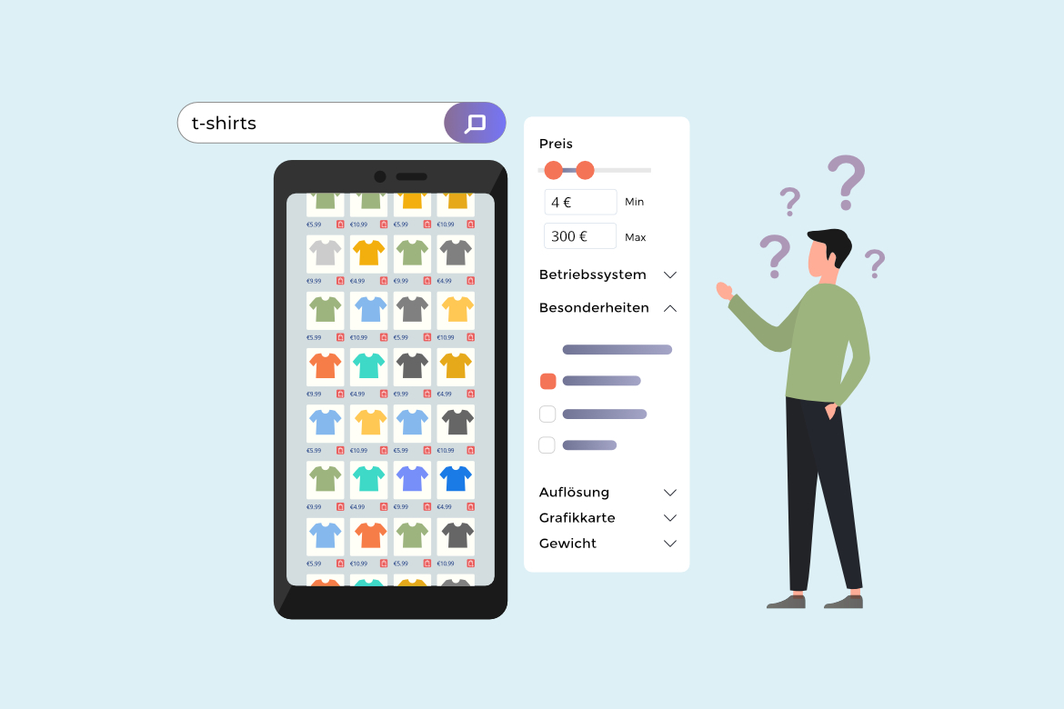
Mistake #8: Failing to Provide Category Search – This Makes Search More Complicated
Site search users can fall into two categories:
- Those who know what they want and will search within categories to find it.
- Those who don’t know what they want and will browse all categories.
Your site search function should be useful for both groups of searchers.
To help users who want to browse the whole site, add an option to their search results that says something like, “Search All Departments.” For example, someone looking for an LED lamp in your home store might want to see results from the lighting, kitchen, and outdoor departments.
The opposite also works, so provide category filters for people who know roughly what they want. In the same example, someone who wants an LED lamp to light their garage workbench is probably not interested in bedside lamps. Give them a filtering option to eliminate irrelevant results.
Mistake #9: Making Site Search Difficult for Mobile Devices Drives Over Half of Shoppers Away
Mobile retail sales were 70.4% of all eCommerce sales in 2020.
If your site search isn’t optimised for mobile devices, you are ignoring most of your potential customers. Sounds like a bad idea, right?
Here’s how to set up your site search for mobile users:
- Optimise the appearance of your site search box. Give it space so it’s easy to find.
- Don’t show too many results or suggestions. Mobile devices generally lose ⅓ of the page to the keyboard. Limit what you show to fit the top ⅔ of the page.
- Get your autocomplete and error tolerance on point to make the journey smoother for people typing on phone screens.
There are two words that should guide your mobile site search design and optimisation.
- Speed is the most important factor. Make your website fast to avoid giving customers a reason to navigate away.
- Clarity is crucial for good mobile UX. Show your customers exactly what they need to see. Product, short description, and price. Nail these and watch the sales roll in.
Mistake #10: Not Using NLP – You’ll Miss Out on Search Intent

Natural Language Processing (NLP) is the science of understanding search intent by learning which groups of words people use together naturally. NLP algorithms boost the relevance of the search results.
Here are some ways NLP can help your site:
- Spelling correction and autocomplete are basic functions of NLP.
- NLP can match synonyms, so “baby shoes,” “infant shoes,” and “newborn shoes” all direct customers to the relevant pages on your site.
- NLP can understand specifications, so a search for “XL blue polo shirt” leads to a page containing those products.
Many search providers use machine learning to match synonyms to searches and results and these become more effective over time. Every search, result, and user interaction is used to build a database of better results.
NLP is very effective for mobile devices, where speed and clarity are so important. Directing a searcher from their query directly to a relevant product page saves navigation steps and loading time.
Conclusion
Site search users are the best converting visitors on your site, yet websites fail to accommodate these valuable customers. If your website is making one of these ten mistakes, follow some of the suggestions to make it better and your customers will reward you with more sales.